

Design comparison

Community feedback
- P@dionysia-lemonakiPosted 3 months ago
Hi, congrats on completing the challenge!
It's looking great – just one suggestion for the HTML:
The images seem to be decorative, as they don't add any essential information to the content. In such cases, it's best to leave the
altattribute empty (alt="") so that screen readers can skip over them.Marked as helpful1 - Account deleted
Hi, DelbertGrady!
Great work on tackling the Blog Preview Card challenge! Your code demonstrates a solid understanding of structure and design principles. Below, I’ve highlighted some strengths as well as suggestions for improvement that could help enhance your project even further.
I.) Strengths:
Semantic HTML: Good use of <main> and <article> for structuring content meaningfully.
CSS Organization: Clear use of :root variables for styling consistency and flexibility.
Typography & Spacing: The layout feels clean, with a thoughtful use of flexbox and gap for alignment.
II.) Areas for Improvement:
1- Hover Effects in CSS: The use of &:hover in your CSS won’t work in plain CSS. Replace it with:
    .card:hover {
      cursor: pointer;
    }

    .card:hover .card-title {
      color: var(--color-yellow);
    }
2- Accessibility Enhancements:
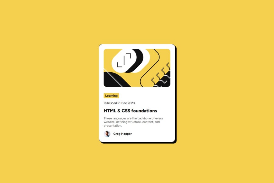
-Use a more descriptive alt for images, e.g., "Illustration about HTML & CSS foundations".
-Wrap the publication date in a <time> tag for semantic and accessibility benefits:
<time datetime="2023-12-21">Published 21 Dec 2023</time>3-Responsive Design:
-The card is fixed at 400px, which may not work well on smaller screens. Using max-width: 90%; or similar units would make it more adaptable.
4-Interactive Accessibility: adding a :focus style will improve usability for keyboard users:
.card:focus {
  outline: 2px dashed var(--color-yellow);
}
|--> Conclusion:
You’ve done an excellent job with this job! With just a few adjustments your project will truly shine. Keep up the great work—you’re well on your way to mastering these skills. 🌟
Marked as helpful0@DelbertGradyPosted 3 months ago@cesarconte Thank you very much for taking the time to post those helpful suggestions!
Regarding the nested CSS selectors (1): This has been working in all major browsers for quite some time -> https://caniuse.com/css-nesting
I know the feature is still in Editor's Draft status and as such hasn't been integrated into the CSS standard, but support for it has been implemented by all major browsers. Is it still bad practice to use this feature? Should I always use explicit selectors as per your suggestion? Does the nesting have unfavorable implications that I'm not seeing?
Thanks again César!
0

Please log in to post a comment
Log in with GitHubJoin our Discord community
Join thousands of Frontend Mentor community members taking the challenges, sharing resources, helping each other, and chatting about all things front-end!
Join our Discord