Not Found
Not Found
Not Found
Not Found
Not Found
Not Found
Not Found
Not Found
Not Found
Not Found
Not Found
Not Found
Not Found
Not Found
Not Found
Not Found
Not Found
Not Found
Not Found
Not Found

Submitted

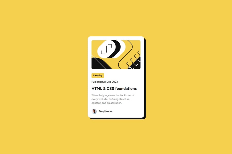
blog preview card using flexbox

@Joliot-TSIMISARAKA

Desktop design screenshot for the Blog preview card coding challenge

This is a solution for...

  • HTML
  • CSS
1newbie
View challenge

Design comparison


SolutionDesign

Solution retrospective


What are you most proud of, and what would you do differently next time?

I'm proud I've successfully finished this project. It was a real challenge as it forces you to look backward and reinforce your foundations. Having experienced the practicability of flexbox, I'm planning to master it alongside its rival, the grid system

What challenges did you encounter, and how did you overcome them?

I wasted quite a bit of time planning the layout of the card and how to go about it. I finally decided to use flexbox with every container inside the card, as long as they have inside items to be aligned.

What specific areas of your project would you like help with?

The part about media query and responsive design best practices, using relative units, are still a real challenge for me

Community feedback

Bshy201 80

@Bshy201

Posted

The best way to test out how media queries and relatives units is to just put them in your code and see what happens. For responsive design, follow a tutorial on Youtube, and you'll figure it out in no time. Keep up the good work!

Marked as helpful

1

@Joliot-TSIMISARAKA

Posted

@Bshy201 You're right, practice is essential when it comes to coding, as we receive instant feedbacks. I'm gonna start the responsive design learning path in this platform to solidify my foundations in that aspect

0
T
Grace 29,310

@grace-snow

Posted

I'm afraid this has quite a few foundational (and very common) mistakes you need to correct before moving on. I hope this list is helpful!

  • the title needs to be high up in the head, straight after the viewport meta is fine. This kind of stuff will matter later in much bigger projects but good to build the habit now.
  • all content should be contained within landmarks. Again it's a good practice to get into so you don't miss it later. This is a single component demo so all you need is a main landmark where you have the container div.
  • look up how and when to write good alt text on images. There are a few good posts about this in the resources channel on discord. Both img alts need to change in this.
  • the heading must use a heading element, not paragraph. That is essential.
  • you know from the design showing a hover style that this card is meant to be interactive. You can also tell that from the content. It's clear that the purpose of this card is to signpost (link) people to a blog. Yet you've not included any link element so the whole card does nothing! Add a link inside that heading element, wrapping the blog title text.
  • you then need to make the whole card clickable according to the design. You can do that by making the card position relative and giving the link a pseudo element that's absolutely positioned to cover the card. That effectively makes the link area as big as the card so the whole thing becomes clickable.
  • as a general rule, text shouldn't ever sit in a div or span alone. Use a meaningful element every time, even just a paragraph.
  • get into the habit of including a full modern css reset at the start of the styles in every project. Andy Bell or Josh Comeau both have good ones you can look up and use.
  • never limit the height of elements that contain text, including the body. Because you've set the body height to 100vh, content can become cut off when the browser tries to squeeze the component in when there isn't room (like on mobile landscape). Instead, use min-height not height. And optionally use a modern viewport unit like svh instead of vh.
  • font size should never be in px. Use rem.
  • this component must not have an explicit width, min-width or height. Remove all. Instead, give the component a max-width only, and write this in rem so the layout scales nicely even for users with a different text size. Giving it a max-width instead of width let's the browser squish it narrower when it needs to (like on my 320px wide iPhone!). Similarly, it doesn't need a height or min-height. Let the browser do it's job and decide what height is needed based on the content inside.
  • there is no need for a media query in this challenge.
  • it's really important you don't nest css selectors like you are doing now. This will become a specificity nightmare and be impossible to manage on larger projects. Instead try to only use single class selectors. Keep the specificity as low/flat as possible by placing classes directly on what you want yo style.
  • similarly, get rid of all the nth child selectors in this. You should be able to read and understand the css, you shouldn't have to go and examine this card and count children to work out what you're styling.
  • don't ever add cursor pointer to non-interactive elements.
  • rather than relying on key words set font weights explicitly with the value you want. "Bold" could differ between browsers.
  • on a related topic I think you have to define the range of weights you want in the font-face declaration if its a variable font (I may be wrong there but worth checking).

Marked as helpful

0

@Joliot-TSIMISARAKA

Posted

@grace-snow Thank you very much ! These aren't the kind of things you could learn on your own, getting such a helpful reply is my fortune. And here I thought that my code was pretty good already, I still have a long way to go. I certainly know a lot of theory but not sure how to make good use of them, I'm severely lacking practical knowledge. I was just fixated on getting it similar to the design.

I'm gonna start again and see what I can do to make my code fulfill all of what you cited above. And when I finish, can I mention you in our Discord group to check out my code again to see if I kinda correct most of these foundational mistakes?

Again, thanks a lot

0
T
Grace 29,310

@grace-snow

Posted

@Joliot-TSIMISARAKA dont "start again" in a new repo. Just update this one and this solution. That's one of the benefits of git version control -— keep the history and see how far you've come.

Marked as helpful

0

Please log in to post a comment

Log in with GitHub
Discord logo

Join our Discord community

Join thousands of Frontend Mentor community members taking the challenges, sharing resources, helping each other, and chatting about all things front-end!

Join our Discord