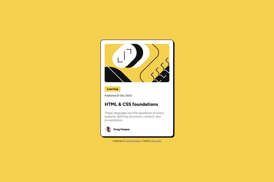
Design comparison
Solution retrospective
I applied some pieces of advice I received on previous projects, like applying more appropriate units to distances. Moreover, I'm happy to start getting a hang of how should I think a CSS bigger component.
What challenges did you encounter, and how did you overcome them?I displayed to elements of the container using flexbox. At some point, when I had to style the category element I realized that when you use flexbox along with flex-direction: column, you get an imitation of a block element, taking the full available width, regardless of that element you try to display(in this case it was a span element). In this situation, I learned that if you add align-items: flex-start, the flex items will then use only the minimum required width, behaving thus like inline elements.
So far, I have nothing specific in mind. However, I will really appreciate to receive comments and feedback regarding what should I improve/correct in this project!
Community feedback
- @taiwogbadamosiPosted 11 months ago
awesome, you should probably remove text on bottom though. it honestly looks perfect to me, i have no suggestion.
0
Please log in to post a comment
Log in with GitHubJoin our Discord community
Join thousands of Frontend Mentor community members taking the challenges, sharing resources, helping each other, and chatting about all things front-end!
Join our Discord
