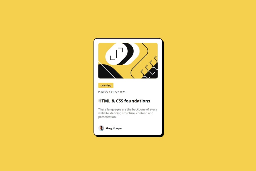
Design comparison
Solution retrospective
I am most proud of my flexbox skills. I have definitely gotten better. I am happy the way it turned out as well.
What challenges did you encounter, and how did you overcome them?I had challenges with flexbox and starting it. But after a couple of hours I got used to everything and it became a lot easier.
What specific areas of your project would you like help with?I still am unsure how to change sizes depending on of it is mobile or desktop viewing. I also still have the problem with spacing between the paragraphs.
Please log in to post a comment
Log in with GitHubCommunity feedback
- P@clickglue
Hi, congratulations with your solution! It looks very good on the screenshot! In the live site however, it uses a different font. I see in your code that you define the font on class level. Maybe you can try to define the font-family on the level of the main container or the body. As far as I know, the font is then inherited on each 'cascade' below. You've made very good use of flex! As next step you might be interested in looking at CSS Variables, this helps you to create clean and consistent stylesheets: https://web.dev/blog/at-property-baseline
Join our Discord community
Join thousands of Frontend Mentor community members taking the challenges, sharing resources, helping each other, and chatting about all things front-end!
Join our Discord
