

Design comparison

Solution retrospective
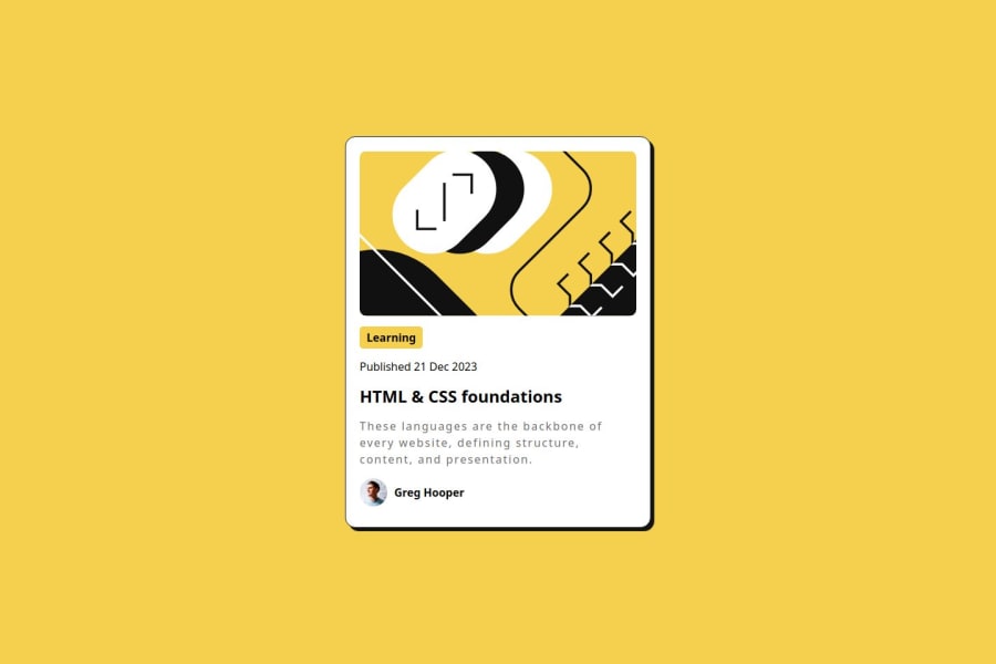
What I am most proud of this project is being able to complete this project in one sitting. I think I did a good job of replicating the screenshot. Not sure what I would do differently but I am always open to many other solutions! Kept it simple and used old fashion HTML/CSS.
What challenges did you encounter, and how did you overcome them?I didn't really encounter any issues. As noted, it's still a simple project.
What specific areas of your project would you like help with?I think a specific area I would like help with is the HTML structure okay? I used simple div tags to distinguish between sections of the card.
Community feedback
- @Jay-RiveraPosted 21 days ago
It seems like the letter spacing or the font size is off in the description section. Other than that, everything looks really well!
1 - @asia272Posted 21 days ago
You can use the
<main>tag for better accessibility by wrapping all content inside it. Instead of using<div>inside<main>, consider using<section>for better semantic structure. Additionally, you have setletter-spacing: 2pxfor.blog-desc; reducing it to1pxwould improve readability.Overall, your solution is good and meets the requirements.
0


Please log in to post a comment
Log in with GitHubJoin our Discord community
Join thousands of Frontend Mentor community members taking the challenges, sharing resources, helping each other, and chatting about all things front-end!
Join our Discord