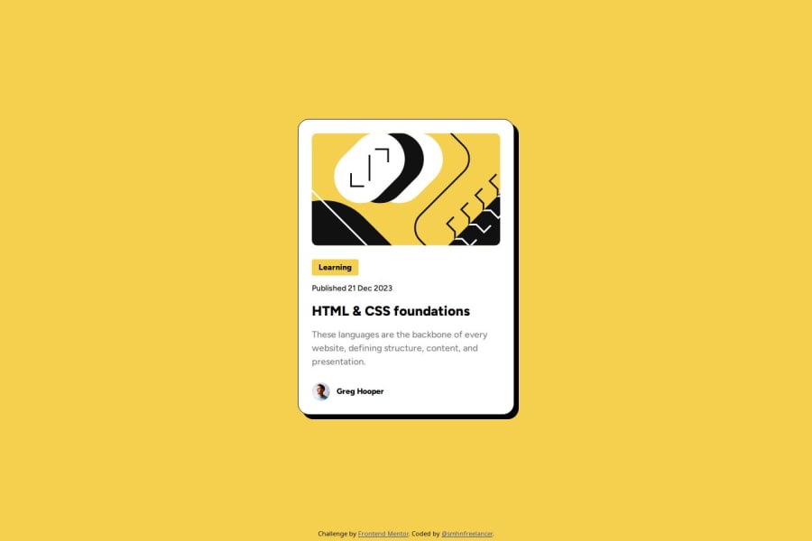
Design comparison
Solution retrospective
I used the Figma layout and I tried to do my best to match the result with the design.
What challenges did you encounter, and how did you overcome them?Several challenges were kind of hard to achieve.
- I finally used
width:66vwin the mobile screen size to make the whole card responsive in all sizes. - I was pretty busy matching the width in the desktop screen size
box-sizing:border-boxfixed the issue. - I used the exact font size and font properties, but my result was slightly different, so I set the
descclass, font size to 17px; instead of 16px and got a better result.
I think I need some help with the understanding difference between the results, even when you use the exact font and exact font-size and font properties.
Also having a fully responsive card in all the mobile sizes made me to use 66vw as width of the card, but I think, there must be a better approach.
Community feedback
- @VH135Posted about 1 year ago
Hi there! Good effort on this chalenge.
I see your desktop design excellent matches with the layout, congrats! Also you've added custom cursor pointer as shown in the layout, that's cool. And I like how you changed your styles to be more readable like this:
    <link
      rel="icon"
      type="image/png"
      sizes="32x32"
      href="./assets/images/favicon-32x32.png"
    />
And there are some points woulbe great to improve:
- Your mobile version of the card differs from the layout significantly.
- Yours HTML classes like "tag" and "desc" are not informative. It woulbe be to name it like "card-tag", "card-desc", for example.
- A couple of your lines of code starts with this symbol:
>, it's not good in terms of readability.
Hope you'll find this helpful.
Marked as helpful1@smhnfreelancerPosted about 1 year ago@VH135 Do you have some recommendations for the mobile version, I was struggling to make it responsive in all the screen sizes. as mentioned in Style Guide. so my approach was to use
width:66vw.0@VH135Posted about 1 year ago@smhnfreelancer I would recommend you this course to learn more about Responsive design and flexboxes:
https://www.youtube.com/watch?v=srvUrASNj0s
0 - @tobiekwePosted about 1 year ago
What I can say is this is super cool effort as I am still finding my level.
0
Please log in to post a comment
Log in with GitHubJoin our Discord community
Join thousands of Frontend Mentor community members taking the challenges, sharing resources, helping each other, and chatting about all things front-end!
Join our Discord
