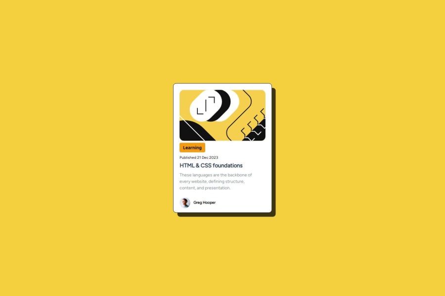
Design comparison
Solution retrospective
the thing I'm most proud of is @media, sure I still have a lot to learn but since I started this challenge I understand and I can do responsive
What challenges did you encounter, and how did you overcome them?one of the challenges was aligning the texts in the card but with research I think it's getting better
Community feedback
- P@Islandstone89Posted 7 months ago
Hi, well done finishing this challenge!
I have taken a thorough look at your code, and there are a few issues - look at it as learning experiences :)
HTML:
-
Do not include words like "image", "avatar" or "photo" in the alt text. Screen readers start announcing images with "image", so including such words is redundant.
-
"Learning" is a
<p>. -
For the date, I would consider using the
<time>HTML element:<p>Published <time datetime="2023-12-21">21 Dec 2023</time></p>. -
Remove the
<strong>tags, it is used for information that is urgent. Remember that HTML is all about meaning, not styling. -
I would change the heading to a
<h2>- a page should only have one<h1>, reserved for the main heading. As this is a card heading, it would likely not be the main heading on a page with several components. -
As this is a blog card, the heading would have a link inside.
CSS:
-
Including a CSS Reset at the top is good practice.
-
I would recommend adding
1remofpaddingon thebody, to ensure the card doesn't touch the edges on small screens. -
Remove
font-family: 'Figtree', sans-serifon the author paragraph - since you have set the font on thebody, all descendants will inherit that value. -
On the
body, changeheighttomin-height- this way, the content will not get cut off if it grows beneath the viewport. -
You can remove
margin: 0onbody, as that is already set on all elements using the universal selector*. -
Except for the profile image, remove all widths and heights in
pxand%. Also, remove themax-widthinpx. -
Add a
max-widthof around20remon the card, to prevent it from getting too wide on larger screens. -
font-sizemust never be in px. This is a big accessibility issue, as it prevents the font size from scaling with the user's default setting in the browser. Use rem instead. -
On the top image, add
display: blockandmax-width: 100%- the max-width prevents it from overflowing its container. Without this, an image would overflow if its intrinsic size is wider than the container.max-width: 100%makes the image shrink to fit inside its container. -
You can remove the styles on
.image-section. -
To create the space between the image and the edge of the card, set
paddingon all 4 sides of the card:padding: 16px;. -
Hence, you can remove
margin-lefton the text elements. -
Add a little
margin-bottomon the top image. -
You don't need to make the card a Flex container unless you want to use
gapto create consistent spacing between the elements. Since you're usingmarginto create the space between elements, you can remove the Flex properties on the parent, as elements stack on top of each other by default. -
This design doesn't change, so I don't think there is a need for any media queries. When you do need them, they should be in
remorem, not px. Also, it is common practice to do mobile styles first and use media queries for larger screens. For future use, if you want to change thefont-sizebased on the viewport, I recommend using theclamp()function. To find the right values, I use this Fluid Typography Calculator, which I find very effective. -
Remove
overflow: hidden, it is not needed.
Marked as helpful1 -
- P@MikDra1Posted 7 months ago
If you want to make your card responsive with ease you can use this technique:
.card {
width: 90%;
max-width: 37.5rem;
}
On the smaller screens card will be 90% of the parent (here body), but as soon as the card will be 37.5rem (600px) it will lock with this size.
Also to put the card in the center I advise you to use this code snippet:
.container {
display: grid;
place-items: center;
}
Hope you found this comment helpful 💗💗💗
Good job and keep going 😁😊😉
Marked as helpful1 - @yours-truly68Posted 7 months ago
size is small,
Marked as helpful1
Please log in to post a comment
Log in with GitHubJoin our Discord community
Join thousands of Frontend Mentor community members taking the challenges, sharing resources, helping each other, and chatting about all things front-end!
Join our Discord
