

Design comparison

Solution retrospective
Of my css design, new things i learn.
What challenges did you encounter, and how did you overcome them?I face a change a challenge at the level of the profile class, center the name was difficult for me.
What specific areas of your project would you like help with?In my HTML body, i have three paragraphs, i wanted to use child selector to apply the style at this level. Please can you help me? Thanks...
Community feedback
- @MarziaJaliliPosted 3 months ago
Congrats buddy!
Well...using the
<p>element for all of those contents does not really give the screen readers enough information.Changes you can make
- use the
<h1>for the heading. - use the
<span>for the date. - use the
<p>for the paragraph.
it will look something like this:
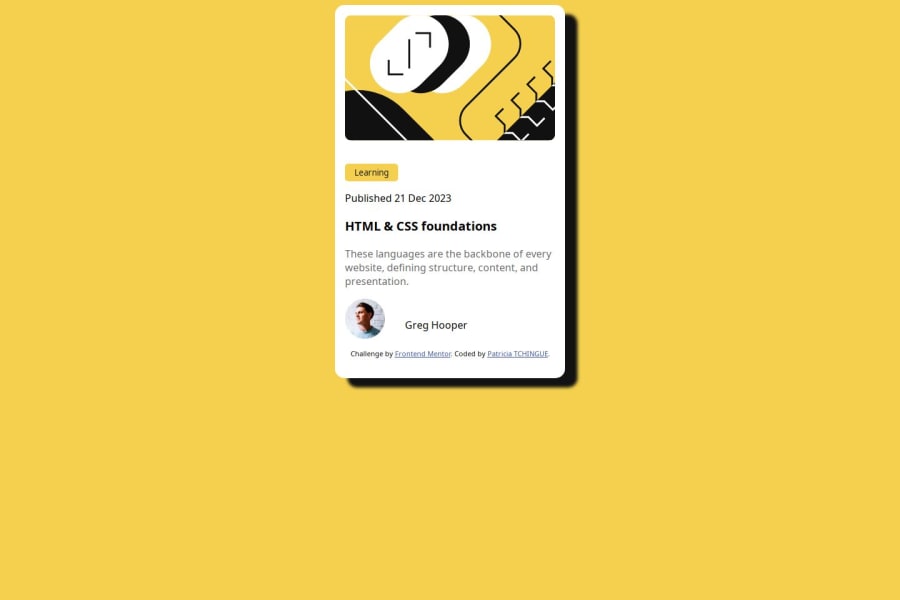
<span>Published 21 Dec 2023</span>
<h1 class="title">  HTML & CSS foundations </h1>
<p class="description"> These languages are the backbone of every website, defining structure, content, and presentation.</p>
Then, you can use the class name for styling the elements.
- On the other hand, to center the card apply the lines below to the
bodyselector:
body { display: grid; place-items: center; min-height: 100vh; }- Also, in order for the code above to work wrapp everything within the <body> element inside the <main> element to make sure <body> only has one child element.
It will look something like this:
<body>
    <main>
        <!-- every element nested inside -->
    </main>
</body>
Hope you find this helpful, keep up the grind 💪
Marked as helpful0 - use the
- @dongkp96Posted 3 months ago
- For the div class ="profile", you did use flexbox with display flex to make them horizontally line up, however, you could also add align-items:center to make them line up correctly.
- It looks like you did not adjust the font weight for the name.
- You used a button element for the Learning square at top. I think you could've put it in a div or kept it simple by having it be a <p> element and style it into the same shape such as by setting width/max-width and then using border-radius to smooth out the edges.
- For the .container div, since its not align correctly, you could probably use display flex, set flex-direction to column and then justify-content to center to line everything up.
Marked as helpful0


Please log in to post a comment
Log in with GitHubJoin our Discord community
Join thousands of Frontend Mentor community members taking the challenges, sharing resources, helping each other, and chatting about all things front-end!
Join our Discord