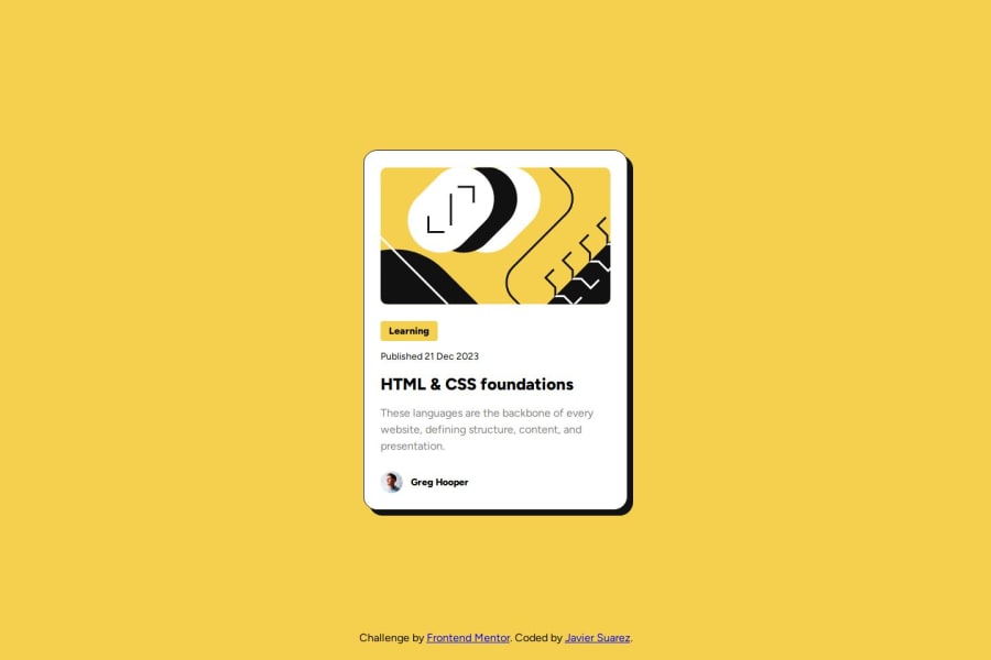
Blog Preview Card Component
Design comparison
Solution retrospective
It was a quick component to work on.
What challenges did you encounter, and how did you overcome them?No significant challenges. Missed a couple of things like the height of the image being the same size for small and large screens, as well as the box-shadow, it also was different on large screens when hover state was active.
What specific areas of your project would you like help with?Feedback and recommendations are welcome
Community feedback
- @sebamarquesPosted 7 months ago
I saw it on live and i must say that i really liked what you did, i'm new in this so i don't think any comments i made will be helpful for you, but i will answer some questions.
- it's Semantic? Yes, but i learned that is recommended not starting the html with div, i saw your code and it starts with div class"root", maybe you you can change it for the semantics and for accesibility
- It looks amazing as i said.
- No, it looks exactly the same as the design, he changed how you interact with it, using a hover and a link for the title, which i liked, but the design it's like looking at a mirror
0
Please log in to post a comment
Log in with GitHubJoin our Discord community
Join thousands of Frontend Mentor community members taking the challenges, sharing resources, helping each other, and chatting about all things front-end!
Join our Discord
