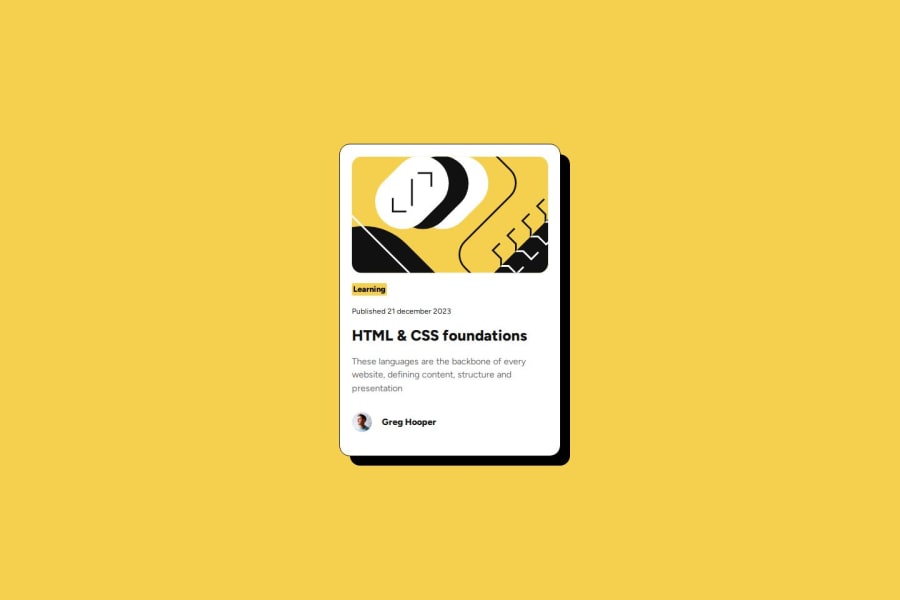


Design comparison

Solution retrospective
I'm happy to learn how to better analyze and prepare before I start coding. Also, CSS start to become more predictable if you structure it properly and do less trial-and-error.
What challenges did you encounter, and how did you overcome them?Using flex is a challenge. Also, I'm not sure if I understand the concepts of 'responsive' correctly.
What specific areas of your project would you like help with?How to implement responsive designs.
Community feedback
- @indigorosePosted 7 months ago
This a great solution to the challenge.
It is clean, responsive to different screen sizes and does not differ to the design.
The hardest part for me too is planning analysing and visualising your solution especially with grid and flex.
As you said, good structure makes it easier to understand, and that is evident in your code using
main,articleandsectionrather than alldivto section your code along with clear class names.Look forward to seeing your other solutions.
Marked as helpful1 - P@SherrisaPosted 7 months ago
Great job! You're project is nicely organized, and your code is easy to read.
For this project, I designed for desktop first and then wrote a media query to adjust the card width and font sizes for mobile. When I examined the Figma files, these were the only values that I saw were different on desktop and mobile. I chose the screenwidth of 576 based on the breakpoints used in Bootstrap.
Here is my code.
@media (width < 576px) {
  body {
    font-size: 14px;
  }
  .card {
    width: 327px;
  }
  .card-category,
  .card-publishdate,
  .card-author {
    font-size: 12px;
  }

  .card-title {
    font-size: 20px;
  }
}
Here is the link to my repository: https://github.com/Sherrisa/blog-preview-card
1 - P@clickgluePosted 7 months ago
Thank you Sherrisa (what a beautiful name), very interesting to see how you can approach the same challenge from very different angles!
0


Please log in to post a comment
Log in with GitHub
Join our Discord community
Join thousands of Frontend Mentor community members taking the challenges, sharing resources, helping each other, and chatting about all things front-end!
Join our Discord