Submitted about 2 months ago
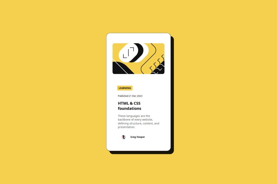
Blog Post review card using html and css

@DiPSAWCE

Design comparison
SolutionDesign

Solution retrospective
What are you most proud of, and what would you do differently next time?
this is one of the easiest projects but it did challange me quite abit, I am proud of getting all the mobile sizes in my css because i got stuck quite abit. If i had to start the project all over i would plan it out better in terms of my workflow and design.
What challenges did you encounter, and how did you overcome them?I missed some minor details in terms of getting the sizes to be exactly same, I tried to use AI to help me get it right but that did not help much.
What specific areas of your project would you like help with?The element sizes espicially the author image i struggled to size it to be the same as the the figma design file.
Community feedback
Please log in to post a comment
Log in with GitHubJoin our Discord community
Join thousands of Frontend Mentor community members taking the challenges, sharing resources, helping each other, and chatting about all things front-end!
Join our Discord