

Design comparison

Please log in to post a comment
Log in with GitHubCommunity feedback
- P@ShanePinderDev
Great job!
I would just consider using a bit of margin-bottom between the main image and the div with the class of "content" as well as between the h2 and paragraph tags. Also, I would use a heavier font-weight for the h4 tag.
Marked as helpful - P@Tempper
Consider using more semantic HTML elements. For instance, if this card represents an article, you might wrap it in an <article> tag and use a <time> element for the publication date with a proper datetime attribute.
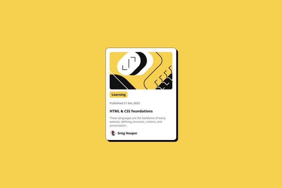
Also, while the main image has a clear alt attribute, you might want to use a more descriptive alt text for the author's avatar, such as "Avatar of Greg Hooper," to enhance accessibility.
In your CSS, you might consider using relative units like rem or em for margins and padding instead of pixels. This makes the design more scalable and responsive. Additionally, in the HTML, change the backslash in the image source for the avatar (assets\images\image-avatar.webp) to a forward slash (assets/images/image-avatar.webp) to ensure consistency across different environments.
The design is nicely centered with Flexbox, but if you plan on expanding the layout or using multiple cards, consider adding media queries or a grid system to maintain a robust layout on various screen sizes.
Marked as helpful


Join our Discord community
Join thousands of Frontend Mentor community members taking the challenges, sharing resources, helping each other, and chatting about all things front-end!
Join our Discord