Submitted 11 months agoA solution to the Time tracking dashboard challenge
BEM responsive Javascript Time Tracking
bem

@donSebamarquez
Solution retrospective
What are you most proud of, and what would you do differently next time?
I really liked this project, in the future i'm going to think how to write the code differently, i have it in my head but i dont have the knowledge to do it the way i want it,
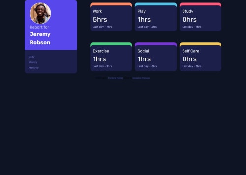
What challenges did you encounter, and how did you overcome them?I used grid area and for me was the most difficult part, i did excercises with a similar design but this one it was difficult for me
What specific areas of your project would you like help with?Whichever area you see i need to practice more or some tips to do it in a different way!!.
Code
Loading...
Please log in to post a comment
Log in with GitHubCommunity feedback
No feedback yet. Be the first to give feedback on Sebastián Márquez's solution.
Join our Discord community
Join thousands of Frontend Mentor community members taking the challenges, sharing resources, helping each other, and chatting about all things front-end!
Join our Discord