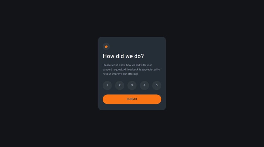
Design comparison
Solution retrospective
I am happy to have properly implemented a BEM architechture in this project and to have made the rating buttons accessible through the keyboard
What challenges did you encounter, and how did you overcome them?I couldn't use a checkbox type input for the design, so I had create custom ones using 'role' attributes and aria-checked attributes.
What specific areas of your project would you like help with?I couldn't get the numbers to be perfectly centered, there is always more space in the bottom. I tried using li elements, p elements, and the problem presisted. Help solving that would be appreciated.
Community feedback
- P@juliengDevPosted 6 months ago
Hi @poissonfou, I'm delighted to be able to chat with you and see what I think you could do better. I saw that you were using li with a chexbox type for the list of votes Using elements with the checkbox role in this case is not semantically appropriate. Checkboxes are generally used when it's possible to make several independent selections, whereas here you have a single choice between 1 and 5, which is better suited to radio buttons.
Why are radio buttons more appropriate?
- Radio buttons are designed to allow the user to make a single choice from several options, which is exactly what you need to select between 1 and 5.
- Users (including those using screen readers) expect this behaviour when the choice is unique and exclusive.
I see you had the following problem: I haven't managed to centre the numbers perfectly, there's always more space at the bottom. I've tried using li elements, p elements, and the problem persists. Help with this would be appreciated.
On your .card__ratings class you're already using flexbox; you just need to add a justify-content : center and align-items : center. there are several ways of centring an element in its box.
You've done everything we expect of a keyboard-accessible site, with validation using the space bar and the enter key to validate the form. Congratulations on your challenge, and I hope you find the comments useful.
0
Please log in to post a comment
Log in with GitHubJoin our Discord community
Join thousands of Frontend Mentor community members taking the challenges, sharing resources, helping each other, and chatting about all things front-end!
Join our Discord
