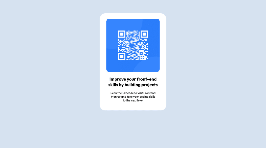
Design comparison
Solution retrospective
I find difficulties on controlling the left and the right gap of the QR code image and the white space. That resulted in me not being able to make a more similar looking website compared to the design, as I feel that aforementioned gaps in the design are smaller than the one I made. Instead of minimizing those gaps, I used paddings to push the image lower, to match the left and right gaps which I couldn't control. Feedbacks are very appreciated on how to solve it
Community feedback
- Account deleted
Greetings! 👋 Congratulations on successfully completing the challenge! 🎉 I would like to provide some feedback on your code that may be of great interest to you.
In terms of HTML, I noticed that the code generates accessibility error reports due to non-semantic markup. It is recommended to replace the non-semantic <div> element with a semantic element like <main> to improve the accessibility and organization of your page. Landmarks are explained, which help define major sections of your page and convey the page's structure. The <main> element should contain all content directly related to the page's main idea, and it is suggested to have only one per page.
Additionally, it is essential to include a level-one heading (<h1>) in your code to identify and describe the main content of the page. It serves as an important navigation point for users of assistive technologies and improves accessibility. Hiding it from visual users using the sr-only class is recommended.
In terms of CSS, I noticed that using margin and padding to center a component is not the best approach. Using Flexbox or Grid layout is preferred to dynamically center the component at all states. To demonstrate, a sample code using CSS Grid is provided.
I hope this feedback is helpful in improving your code. Keep up the great work, and happy coding! 😄
0 - @0xabdulkhaliqPosted about 2 years ago
Hello there 👋. Congratulations on successfully completing the challenge! 🎉
- I have other recommendations regarding your code that I believe will be of great interest to you.
HTML 🏷️:
- This solution generates accessibility error reports, "All page content should be contained by landmarks" is due to
non-semanticmarkup, which lack landmark for a webpage
- So fix it by replacing the
<div class="white">element with the semantic element<main>in yourindex.htmlfile to improve accessibility and organization of your page.
- What is meant by landmark ?, They used to define major sections of your page instead of relying on generic elements like
<div>or<span>
- They convey the structure of your page. For example, the
<main>element should include all content directly related to the page's main idea, so there should only be one per page
HEADINGS ⚠️:
- And, this solution has also generated accessibility error report due to lack of level-one heading
<h1>
- Every site must want at least one
h1element identifying and describing the main content of the page.
- An
h1heading provides an important navigation point for users of assistive technologies, allowing them to easily find the main content of the page.
- So we want to add a level-one heading to improve accessibility by reading aloud the heading by screen readers, you can achieve this by adding a
sr-onlyclass to hide it from visual users (it will be useful for visually impaired users)
CSS 🎨:
- let me explain, How you can easily center the component.
- We don't need to use
marginandpaddingto center the component both horizontally & vertically. Because usingmarginorpaddingwill not dynamical centers our component at all states
- To properly center the component in the page, you should use
FlexboxorGridlayout. You can read more about centering in CSS here 📚.
- For this demonstration we use css
Gridto center the component
body { min-height: 100vh; display: grid; place-items: center; margin: 0; }- Now remove these styles, after removing you can able to see the changes
.white {
  margin: 5% auto 5% auto;
}
.
I hope you find this helpful 😄 Above all, the solution you submitted is great !
Happy coding!
0 - @FabianWassermannPosted about 2 years ago
First of all, you did a great job! I looked at your code and found why it was difficult for you to control the spacing.
You used % for nearly everything. I prefer using rem instead. It gives you better control and for smaller devices you can use media queries. You can give the card a max-width so that the card can not get bigger at some point but can always get smaller. Let the content inside of the card decide how big your card gets. When you use px, em or rem for the padding it will be much easier to control.
I hope this helps. 😉
0 - @jordanhevePosted about 2 years ago
I would recommend using REM or EM units instead percentage units for example:
main {
  padding: 2rem;
  margin: 1rem;
}

h2 {
  margin-left: .5rem;
  margin-right: 5rem
}
I usually use percentages to manage the width or height on some divs or buttons hope I've helped :)
0
Please log in to post a comment
Log in with GitHubJoin our Discord community
Join thousands of Frontend Mentor community members taking the challenges, sharing resources, helping each other, and chatting about all things front-end!
Join our Discord
