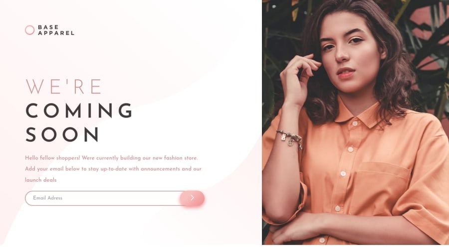
Base-Apparel-Coming-Soon-Master. Use CCS Flex Box
Design comparison
Solution retrospective
This is my 3 challenge, in this challenge I applied some tips from my previous challenge.
I am open to all comments, advice and suggestions to continue learning more on front end. Thank you
Community feedback
- @skyv26Posted almost 3 years ago
Hi! Wayne, I saw your Font sizes are way too big as per requirement.
You can change your placeholder text size by using input:: placeholder property in css.
Button is not exactly aligned with input . Use absolute for button and relative position for input box container to make it perfect
Marked as helpful1@waynerafael15Posted almost 3 years ago@skyv26 Greetings friend, if you are right the font size is somewhat large, I will improve those details.
The button in the input I positioned it with absolute position and in its container with relative, I am going to verify that it is not 100% aligned.
I will take all your advice and put it into practice to keep improving.
Thank you very much for your advice and observations.
1 - @vBenTecPosted almost 3 years ago
Hello Wayne, Congrats for your work.
I noticed some things you could improve.
- Background image
- Visual hierarchy paying more attention on the whitespace, line-spacing
Marked as helpful1@waynerafael15Posted almost 3 years ago@BenChis Greeting. Thank you for your observations, I will take it into account and put it into practice.
The background image, I didn't really notice it, I have noticed it now that you mention it. Most likely I won't notice it because of the colors on my monitor.
Thank you
0
Please log in to post a comment
Log in with GitHubJoin our Discord community
Join thousands of Frontend Mentor community members taking the challenges, sharing resources, helping each other, and chatting about all things front-end!
Join our Discord
