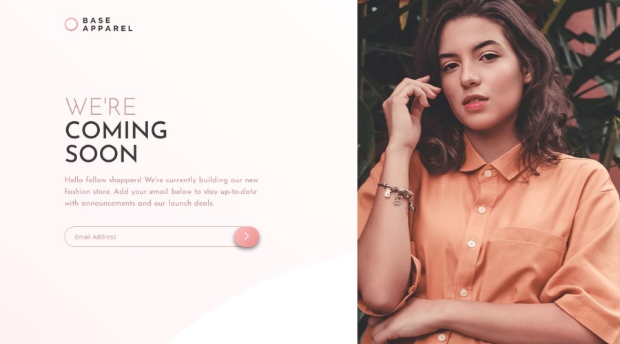
Base apparel page with React, Sass, Jsx


Design comparison

Solution retrospective
.
What challenges did you encounter, and how did you overcome them?.
What specific areas of your project would you like help with?.
Please log in to post a comment
Log in with GitHubCommunity feedback
- @skyv26
Hi @tatyanepgoncalves,
I noticed a couple of areas in your form design that could use some fine-tuning for better alignment and user experience. Here's my suggestion:
1️⃣ Align the Email Button Properly
The button inside the email input field is not aligned correctly. To fix this, you can add aheightproperty to the button styling. Here's an example that should work:.btn-submit { background: linear-gradient(135deg,#f8bfbf,#ee8c8c); padding: 10px 23px; border-radius: 23px; border: none; height: 100%; position: absolute; right: 0; top: 0; box-shadow: 0 5px 10px #00000080; cursor: pointer; transition: all .5s; }2️⃣ Position the Error Message for a Cleaner Look
Consider making the error message element's positionabsolute. This approach prevents it from disrupting the layout flow of the page and works well with theheightadjustment applied to the button. Here's an updated style:.form-group.error .error-message { color: #f96262; text-align: left; position: absolute; }One more thing add
position: relativeto the form-group class, otherwise your button will acquire full screen height, doing this, will restrict the button height only up to the length of the form-group.These changes should give your form a more polished, visually appealing, and user-friendly design. Keep up the great work! 🚀 Let me know if you need help testing this out. 😊
Best regards,
Aakash Verma

Join our Discord community
Join thousands of Frontend Mentor community members taking the challenges, sharing resources, helping each other, and chatting about all things front-end!
Join our Discord