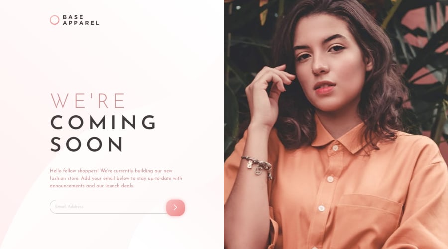
Base Apparel coming soon page using HTML, CSS and vanilla JS
Design comparison
Solution retrospective
This one was trickier than it seemed.
I couldn't figure out the background and fixing the size of the image, but yeah it was fun!
Learned about Email validation using JS and had a good practice on how to use Grid.
Any feedback would be welcome!!
Community feedback
- @MasterDev333Posted over 4 years ago
Great work @greeshma. In my humble opinion, it would be great if you use background-image for woman. You may use div element rather than img tag to get clear picture and responsive results.
<div class="section-banner"></div> .section-banner { background-image: url('./images/hero-desktop.jpg'); background-size: cover; background-repeat: no-repeat; background-position: center; } Hope it helps. Happy coding :)0 - @ApplePieGiraffePosted over 4 years ago
Hey, Greeshma! 👋
Nice to see you complete another challenge! Good work on this one! 👍
I suggest,
- Taking a look at your solution report and trying to clear up the few errors that are there (such as by labeling the form elements in some way to make your solution more accessible).
- Allowing the design to scale up with the size of the screen would be nice so that there is no empty space to sides of the design on extra-large screens. 😉
Keep coding (and happy coding, too)! 😉
0@Greeshma2903Posted over 4 years ago@ApplePieGiraffe thank you for the feedback! will definitely look into it!
Happy coding to you too!
0
Please log in to post a comment
Log in with GitHubJoin our Discord community
Join thousands of Frontend Mentor community members taking the challenges, sharing resources, helping each other, and chatting about all things front-end!
Join our Discord
