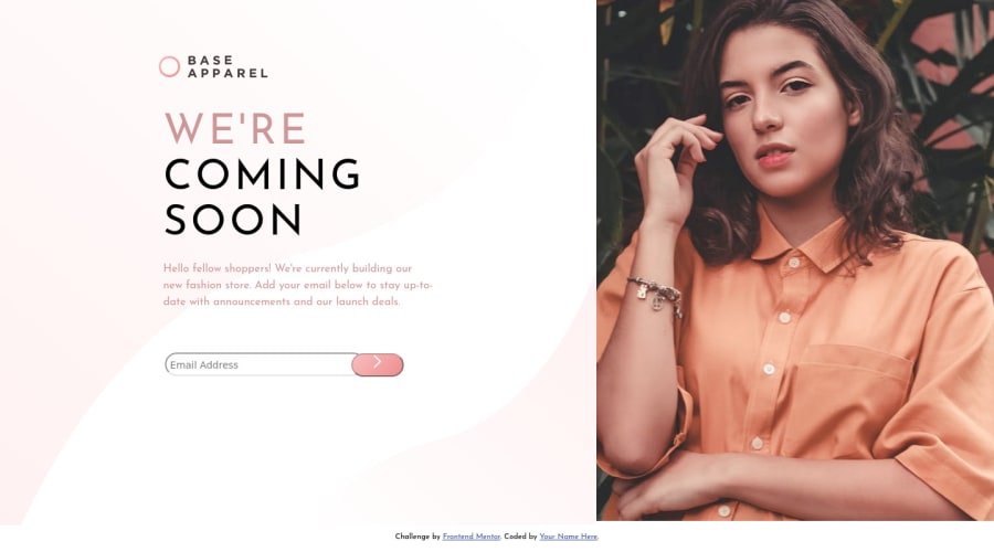
Design comparison
Solution retrospective
I am newbie to frontend development , It will be great help If you can have a look on my code and tell whether I am using best practices or not
Community feedback
- @Greeshma2903Posted about 4 years ago
Hey Soransh!
Nice work, but you have scope for improvement 😊. I am no expert, but being part of this community, I'll be happy if I could be any help!
First up, you can clear the Accessibility and HTML issues that have been pointed out 👆. I think your main focus with this project was on CSS and not the functionality (through JS) because while clicking on the button, the page got redirected, instead of a page reload.
With regard to your code, I recommend using shorthand property over specific properties (increases readability), for eg : instead of
padding-left: 30px;padding-right: 30px;padding-bottom: 6px;you can use,padding : 0px 30px 6pxGood work with the background there! Happy coding 😄👍
2@soransh-singhPosted about 4 years ago@Greeshma2903 hey thanks for your feedback, I tried to clear all the accessibility issue but was not able to solve the last one, can you tell how I can clear that. I tried to change some code and do shorthand as you suggested and keep that in my mind next time. Thanksss....
0@Greeshma2903Posted about 4 years ago@soransh-singh
👆This accessibility issue is due to the absence of
<label>before the<input>tag. Input tag requires you to define a label for it (this makes the input more accessible and explains its presence on the site). So in this project, you define the "Hello fellow shoppers!..." part as a label, instead of putting it under<div class=content>.You can read up more about the same from ( https://developer.mozilla.org/en-US/docs/Web/HTML/Element/label )
Hope this helps! 😊
1
Please log in to post a comment
Log in with GitHubJoin our Discord community
Join thousands of Frontend Mentor community members taking the challenges, sharing resources, helping each other, and chatting about all things front-end!
Join our Discord
