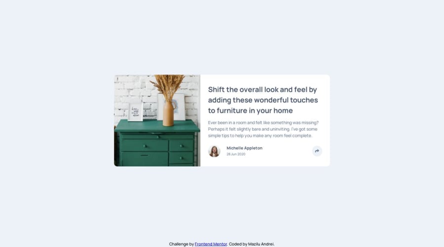
Design comparison
Solution retrospective
This is my third challenge. I had a few troubles positioning the popover but in the end I managed to get it right. I was wondering if there was an easier way to position it without adding the absolute position? I tried with fixed position but it didn't work. Maybe I did it wrong. Also, is there a way I can move the image a little to the right so it looks like in the design picture? At first, I set the image as a background to the div and tried moving it with background-position but I didn't have success.
Community feedback
Please log in to post a comment
Log in with GitHubJoin our Discord community
Join thousands of Frontend Mentor community members taking the challenges, sharing resources, helping each other, and chatting about all things front-end!
Join our Discord
