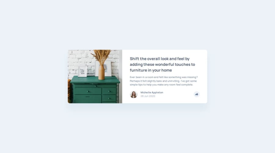
Article Preview Component using HTML, CSS and JS


Design comparison

Solution retrospective
It was a very enriching experience. Initially, I thought it would be similar to another card project we worked on, but this one is much more complex because it involves many changes in positioning and the appearance of the share bar. What I learned is reflected in my code.
One thing I wish I had done differently is the layout transition. I’d like the layout change to be less abrupt. I’ll try to improve this in the next project.
What challenges did you encounter, and how did you overcome them?I need to expand my knowledge about responsive images.
What specific areas of your project would you like help with?I’m open to any kind of feedback. If you noticed an area for improvement or something I might have overlooked, feel free to share!
Community feedback
- P@lia-oliveiraPosted 3 months ago
Hi @Fbeye04,
First of all, I’d like to thank you for the compliment. I’m really glad you liked it! I’ll list a few resources that help me, and you can decide if you’d like to use them as well:
1 - I use a Chrome plugin called Perfect Pixel (recommended by @benssssss) to compare what I’m building with the original design.
2 - I watch tutorials about Pixel Perfect on YouTube. For example: From Figma Units to CSS for Pixel Perfect Layouts - 2 Methods.
3 - I research documentation and well-known blogs like CSS Tricks and MDN.
4 - I check all the links recommended in the Frontend Mentor articles.
5 - For JavaScript, I’m taking a course on a platform called Origamid here in Brazil.
6 - I have two reference books: JavaScript: The Definitive Guide and HTML5 and CSS3 by Elisabeth Castro and Bruce Hyslop.
7 - I save in the project repository any links where I learned something new. This helps me remember how I found at a particular solution when I need to apply it to another project.
Thank you!
2@benssssssPosted 3 months ago@lia-oliveira project size perfect!
in the .nav-share ul you could use align-items: center to center twitter icon vertically, is a bit upper than the other icons
Marked as helpful1@Fbeye04Posted 3 months ago@lia-oliveira thanks for some of the resources you provided, it really helped me.
1 - @Fbeye04Posted 3 months ago
Hi, I've seen your work and I'm amazed that this is the best I've seen from the display that has the size that the project requests, the share button function that runs smoothly and the good code writing. Do you have any suggestions for me on how you can code like you have, how you can customize the look of your project to make it similar to the example, and how you can learn javascript especially as a beginner? I hope you will be pleased with my questions.
1


Please log in to post a comment
Log in with GitHubJoin our Discord community
Join thousands of Frontend Mentor community members taking the challenges, sharing resources, helping each other, and chatting about all things front-end!
Join our Discord