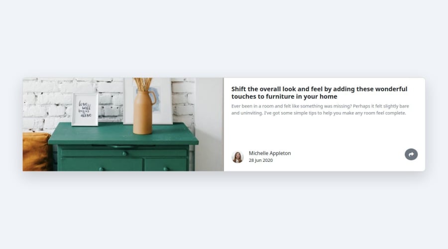
Design comparison
Solution retrospective
I encountered challenges with handling complex user interactions and ensuring the DOM updated in real-time without lag. To overcome this, I used event listeners efficiently and organized my JavaScript code to manage multiple elements. Debugging tools also helped identify issues quickly and fix them.
What specific areas of your project would you like help with?I would appreciate help with optimizing my JavaScript code for better performance, particularly when handling multiple event listeners. Additionally, I’d like feedback on how to refactor my code to make it more modular and maintainable for future updates.
Community feedback
- P@dantviPosted 6 months ago
Great job in completing the challenge! I can see that you have used Bootstrap as a tool to build up your webpage. It is good that you are working with frameworks to improve the time it takes to code front end applications. Your webpage is fully responsive and does a good job in handling different screen sizes.
However, the design of your card is quite different from the design file. On desktop the following improvements can be made:
- Instead of having the main image take up fifty percent of the card try using like 1/3 instead.
- Check the max width of the card element so it doesn’t become so large on desktop screens.
- The colour of your fonts is not entirely correct, try using a more greyish blue.
Kind regards Daniel
Marked as helpful0@mudasirNadeemPosted 6 months ago@dantvi thank for your feedback so but here I want to apply js code only i do not want to make best responsive page
0
Please log in to post a comment
Log in with GitHubJoin our Discord community
Join thousands of Frontend Mentor community members taking the challenges, sharing resources, helping each other, and chatting about all things front-end!
Join our Discord
