Design comparison
Community feedback
- P@toshirokubotaPosted 2 months ago
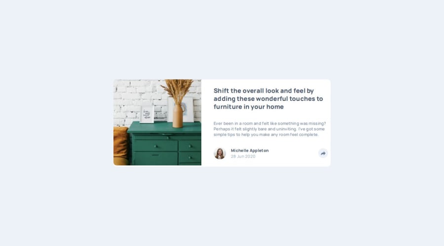
Hi, I looked at your project, and it looks good. One thing that I noticed was that on a mobile view, the share tooltip does not fully cover the avatar. You could make the tooltip larger to hide it, but the share button still moves as you open/close the tooltip.
I just finished the same challenge, and what I did was to put the avatar/profile and the share button into a grid container, and put the tooltip also in the same grid cell with the avatar/profile. When you click the button, it toggles the visibility of the tooltip. This way, nothing really moves. For tablet/desktop version, I made the tooltip absolute positioned.
Hope this helps. Good job!
0
Please log in to post a comment
Log in with GitHubJoin our Discord community
Join thousands of Frontend Mentor community members taking the challenges, sharing resources, helping each other, and chatting about all things front-end!
Join our Discord
