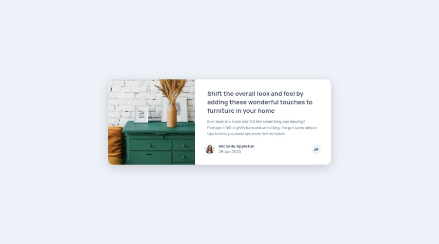
Design comparison
SolutionDesign
Solution retrospective
Hello ! I'm back with my new solution of this challenge. It was so fun to learn how to animate, use JS with the DOM, and create very little animation.
If you have any feedback, feel free to comment :) !
Best,
Logan
Community feedback
- @fidellimPosted about 3 years ago
Hi @LoganWillaumez,
Great work finishing the project! It looks great on both desktop and mobile views. Some suggestions I would like to share are of the following:
- You could try implementing semantic tags on your project. So that it gives meaning to it. It will also be easier for other developers or users to have a broad idea of what the content would be.
- You could add
cursor: pointeron social media icons as it would appear that these can be clicked. - On mobile view, the social media icons are not shown when the right arrow key is pressed. You might want to have a look at that.
Other than those, great job :)
Marked as helpful1@LoganWillaumezPosted about 3 years agoHello @fidellim and thanks for your feedbacks and your help !
I corrected my project and I'll check some documentation for properly improve the meaning of my HTML :).
Have a nice day !
1
Please log in to post a comment
Log in with GitHubJoin our Discord community
Join thousands of Frontend Mentor community members taking the challenges, sharing resources, helping each other, and chatting about all things front-end!
Join our Discord
