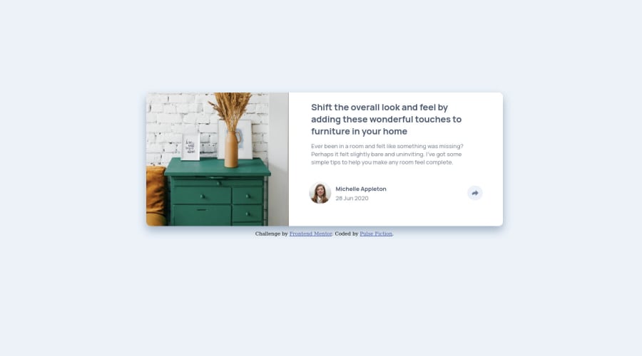
Design comparison
SolutionDesign
Solution retrospective
Any feedback is appreciated!
Community feedback
- @brkclnPosted over 3 years ago
Hello there, thanks for sharing your work. I can say 2 3 thing about your work..
- Avoid to set "width and height" most of time you don't need,
- Don't use "Pixel" for width, height its not a good practice and not responsive, use "em, vh or %" can search it. Padding and margin use "em" for sure..
- Don't set width on body not a good practice,
- For font-size you can use "rem" more responsive and new try to avoid "pixel",
- And its not centered use of "height, left, right" etc.. Keep up ^^
Marked as helpful1@PulseFictionPosted over 3 years ago@brkcln Thank you for taking the time to give feedback! I'll definitely make sure to incorporate the different units in my next project.
1
Please log in to post a comment
Log in with GitHubJoin our Discord community
Join thousands of Frontend Mentor community members taking the challenges, sharing resources, helping each other, and chatting about all things front-end!
Join our Discord
