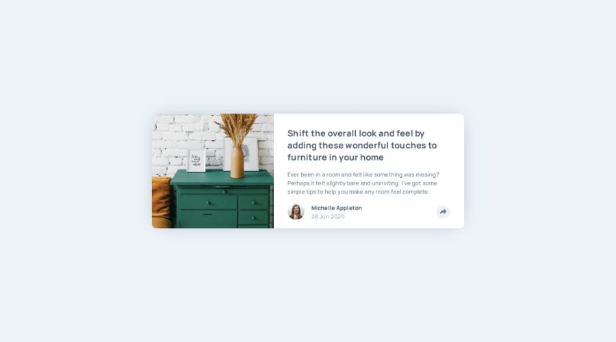
Design comparison
SolutionDesign
Solution retrospective
What are you most proud of, and what would you do differently next time?
how did you manage to do it
What challenges did you encounter, and how did you overcome them?on the desktop view, the position of the share div, but I solved it by putting the whole thing in a div and adjusting the absolute position accordingly
What specific areas of your project would you like help with?the problem mentioned above, as I solved it, can hang out of the viewport at certain screen sizes
Community feedback
- @Alexandru736Posted 9 months ago
Hey there! Your solution looks awesome. Keep it up!
0
Please log in to post a comment
Log in with GitHubJoin our Discord community
Join thousands of Frontend Mentor community members taking the challenges, sharing resources, helping each other, and chatting about all things front-end!
Join our Discord
