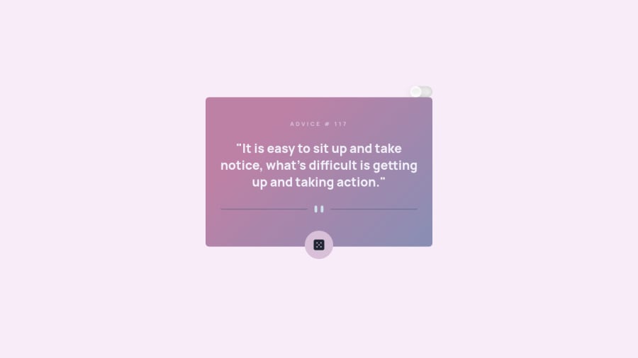
Animated Advice Generator App with Dark/Light Mode
Design comparison
Community feedback
- @Mustapha62996Posted almost 2 years ago
This is really impressive 🔥🔥
Hopefully I will be able to code like this someday
1 - @SoniBasantPosted almost 2 years ago
When I first saw this in comparison box, I thought why you did this!!
Then I saw the that button and realized what you did there. 😀
Colour selection for light theme is good.
Good job. 👏👏
PS: I need to follow some advice from advice generator. Also, need to make some projects in Frontend Mentor. 🏃♂️🏃♂️
1@ecemgoPosted almost 2 years ago@SoniBasant Thank you for your kind words🤗
I know it looks different at first but I've done it consciously. If I made it like the original one, the dark/light toggle wouldn't appear or attract attention. In this way, this color makes you wonder why I used it😊 Also, I've used the Space Color for the color of the light theme if you wonder how I set the color.
Indeed, I had done the same challenge about 1 month ago, I wanted to improve it a bit by adding animation and dark/light mode and I uploaded it that way.
PS: Doing a project in Frontend Mentor improves your skills a lot😉 It helped me in improving my frontend skills😊
3@SoniBasantPosted almost 2 years ago@ecemgo Thanks for the color palette. 🎨This is a really helpful. 🙌
1
Please log in to post a comment
Log in with GitHubJoin our Discord community
Join thousands of Frontend Mentor community members taking the challenges, sharing resources, helping each other, and chatting about all things front-end!
Join our Discord
