Design comparison
SolutionDesign
Community feedback
- @Sdann26Posted over 2 years ago
Hi, Avitohol!
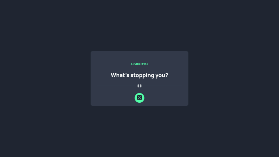
The advice-title class give it the following attribute if you want
letter-spacing: 4pxto be able to separate the letters.Also if you want to position the button as the design you could do the following:
- To the
.boxclass give itposition: relative;because we are going to position the button in this box. - Then to the
dice-btnbutton give the following classes:
position: absolute;
left: 50%;
bottom: 0;
transform: translateY(50%) translateX(-50%);
The thing that is absolute so that positioned in the box box without occupying space and with left and bottom we position it below and to the right and then with the translation, the percentage is with respect to the size of the child so with that you position it as it is in the design.
I hope it is understood and it is useful :D
Marked as helpful1 - To the
Please log in to post a comment
Log in with GitHubJoin our Discord community
Join thousands of Frontend Mentor community members taking the challenges, sharing resources, helping each other, and chatting about all things front-end!
Join our Discord
