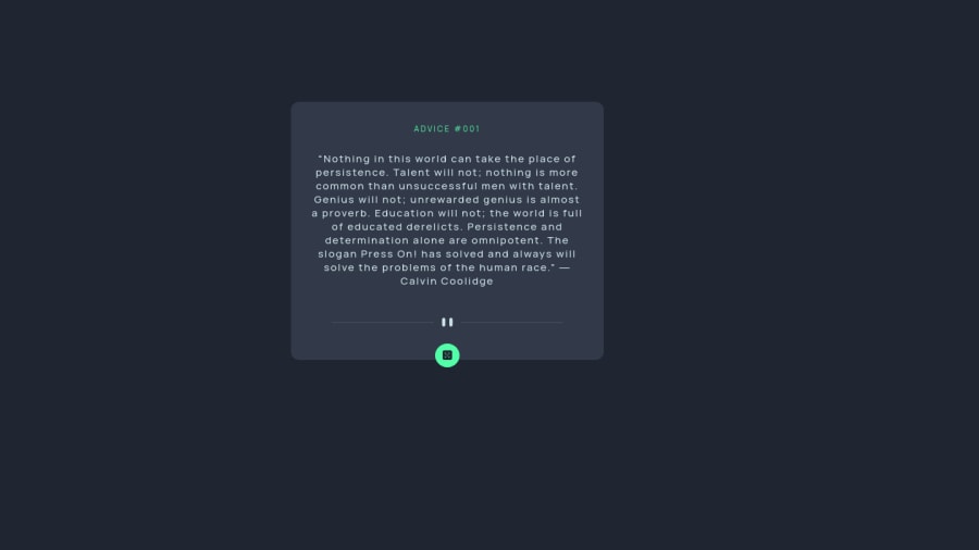
Advice generator app


Design comparison

Solution retrospective
I just completed this challenge and would love to get feedbacks and critics on how to improve further! Thanks.
Please log in to post a comment
Log in with GitHubCommunity feedback
- @DonUggioni
Hey Aijalon, great job on this one!
The code looks good and the JS and easy to read.
A couple of things I would have done differently are:
To center your
.main__container, you could have set thebodytodisplay: flex, align-items: center, justify-content: centerThis way, you make sure it's always centered in the screen.
Other thing is the button, you could have used the
:hoverpseudo-class instead of the:active, or even better, you could have used both, for example: on:hoveryou apply the current shadow and then on active, you can reduce the spread a bit to create a visual effect when you press the button.Other than that, pretty good job 👍 Keep it up!
Marked as helpful

Join our Discord community
Join thousands of Frontend Mentor community members taking the challenges, sharing resources, helping each other, and chatting about all things front-end!
Join our Discord