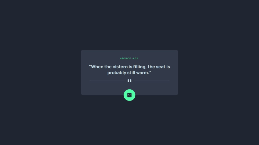
Design comparison
SolutionDesign
Solution retrospective
Happy coding as always guys and girls! :)
Please log in to post a comment
Log in with GitHubCommunity feedback
- @tediko
Hi @tloxiu!
Congrats on completing your next challenge! A little feedback from me:
.dice-icondiv element should be replaced withbuttontag. Buttons trigger some action, such as drawing next advice in your case..dice-imgimage is purely decorative. You should removealttext from that image since it doesn't add information to the content of a page. Instead addaria-label="generate next advice"to your button to inform users that use some form of assistive technology what kind of behaviour they can expect.- Instead of putting image within your
button, try to use::beforepseudo-element to add this image to button element. - You shouldn't put two images into your HTML and remove one with
display: noneproperty. It will cause performance issues since both images need to load on each screen size. Instead use<picture>HTML element for responsive images. This element allow to display identical image content, just larger or smaller depending on the device. This helps to improve performance across different devices. - Don't set explicitly
widthon your.cardcontainer. Let your content decide how much space it need. It will make your container more responsive. Usemax-widthinstead to say how big it can grow. Add this to your card:max-width: 33.8rem; width: 100%; - Now you have to add
paddingto yourbodysince your container want to stretch full screen width. Add something likepadding: 1rem.
Good luck!
Marked as helpful
Join our Discord community
Join thousands of Frontend Mentor community members taking the challenges, sharing resources, helping each other, and chatting about all things front-end!
Join our Discord
