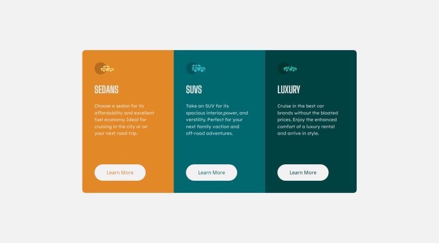
A responsive 3-Column-Preview-Card built with HTML CSS Grid


Design comparison

Solution retrospective
This is my first time using CSS grid to build a challenge
What challenges did you encounter, and how did you overcome them?It was as easy as it could have been
What specific areas of your project would you like help with?I want an overall feedback on the challenge
Community feedback
- @erntTt94Posted 5 months ago
Hello, good job! My advice for you is instead of px you can use rem and with media you can set html font-size and all of your elements will shrink or grow... and its not a huge deal, but its good to have a different name on your css file.. for example: style.css. Otherwise is really well done, keep doing it.
Marked as helpful0@TaophyccPosted 5 months ago@erntTt94 Thank you for the feedback. Can you please explain what you mean by media and setting html font-size?
1@erntTt94Posted 5 months ago@Taophycc Hello, instead of using px and "hard-coding" your width,font-size and etc.. and by that i mean when the width of your page is going smaller and smaller, your components will remain the same, because of the px.. and if you change them to be rem instead of px they will change accordingly of your html root font-size.. by default your html root have 16px font-size and by setting your **media at different sizes where you need it, you can set html { font-size: 14px for example} and all of your other elements where you set them to be 1rem will be 14px.. and 2rem - 28px and you can play with them if you want to shrink or grow your elements... Like here - .grid-container { font-size: 15px; } .. it will be all the time 15px and at 448px your container is much bigger than your html, but instead of using font-size: 15px you can set it to be 0.9rem and will change depends of the html font-size.. and also for your max-width you can set it to be rem or %..
Its best to practice it like making a container with <div> and some elements inside of it.. than set all of them to be rem and set your style at different sizes by example at 800px @media (max-width 800px) { html { font-size: 14px } or 12px and you can practice if you want your page to be responsive, otherwise with px it will be hard-coded... you can check % for width and height and vw and vh..
Marked as helpful0

Please log in to post a comment
Log in with GitHub
Join our Discord community
Join thousands of Frontend Mentor community members taking the challenges, sharing resources, helping each other, and chatting about all things front-end!
Join our Discord