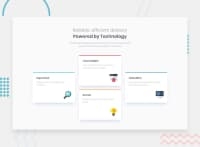
Design comparison
SolutionDesign
Solution retrospective
Any and all feedback is welcome!
Community feedback
- @tedikoPosted over 3 years ago
Hello, Rizwan Mustafa! 👋
Congrats on finishing another challenge! Your solution responds well and looks good. Here are few suggestions from me:
- You can use just one heading element for
.light. Just wrap text that you want to be bold with<span>and style it. - Since your icons image is decorative your
alttext should be provided empty (alt="") so that they can be ignored by assistive technologies, such as screen readers. - Read about Sass 7-1 pattern to keep your file management orginazed.
Good luck with that, have fun coding! 💪
1@rizwanmustafaPosted over 3 years ago@tediko Thanks alot. Will look into the pattern!
0 - You can use just one heading element for
Please log in to post a comment
Log in with GitHubJoin our Discord community
Join thousands of Frontend Mentor community members taking the challenges, sharing resources, helping each other, and chatting about all things front-end!
Join our Discord

