Design comparison
Solution retrospective
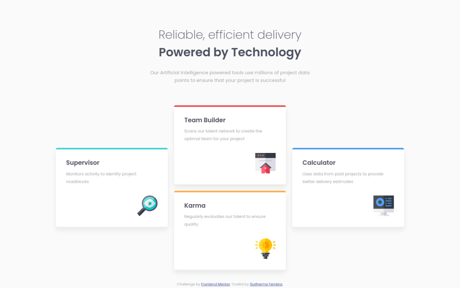
Hello community! Since I uploaded my last solution here (it's been a while), I've been studying a lot, reading and trying out many things and decided to try my flexbox skills. I still have difficulties with the measurements, but I think it looks good on this one.
I want to hear any feedback from you. How is my solution? Is my code clean? Any improvements I could implement or any different approaches to something I've done?
Thank you very much!
Community feedback
- @dewslysePosted over 3 years ago
Hello @guilhermerera! Congrats on your submission. I just completed this challenge and I think your page looks very good and, is responsive even to the tiniest of devices. Good job. I am also loving your README.md. The screenshot is awesome.
- You could consider using more semantic html e.g: you could use
articlefor the individual cards. - the wildcard (
*) selects all objects on your page. As such, the properties associated with elements on lines 5 - 7 of your css could be added to line 2.
Happy coding
Marked as helpful1@guilhermereraPosted over 3 years ago@dewslyse Thanks a lot! I just checked you solution and it's amazing! Congrats.
Also, those tips were really valuable, especially the one about semantic html. Thanks again! :)
1 - You could consider using more semantic html e.g: you could use
Please log in to post a comment
Log in with GitHubJoin our Discord community
Join thousands of Frontend Mentor community members taking the challenges, sharing resources, helping each other, and chatting about all things front-end!
Join our Discord
