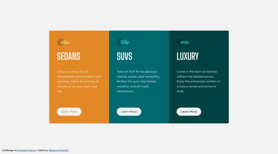
3-column preview card component using HTML and CSS
Design comparison
Solution retrospective
Hello everyone
I hope all is well.
I have a couple questions about my HTML structure.
- Should I wrap each card component using an article tag or section tag along with using aria-labelledby="" attribute?
<article class="card">
  <h2 class="card__title"></h2>
</article>

<section aria-labelledby="sedans">
  <h2 id="sedans"></h2>
</section>
- In Firefox, I checked the inspected acessibility properties and had a warning like a text label with the figure tag. To fix the issue I added figcaption with the visually hidden class for screen readers. Do I need need to keep the figcaption or remove it?
<figure>
  <img src="./assets/images/icon-sedans.svg" alt="" aria-hidden="true" />
  <figcaption class="visually-hidden">Sedans</figcaption>
</figure>
- The color given in
styleguide.mdfile has color constrast issue for the paragaphs, what color should I use to fix this issue?
Thank you for taking the time to look at my solution and feedback greatly appreciated.
I made a custom version of this challenge: Custom version
Rebecca
Community feedback
- @DudeldupsPosted over 1 year ago
Hello 🙂
Your solution looks awesome, good work!
For semantics, when to use an article element is quite controversial if you ask me. The general definition is it should "make sense on its own", without needing to see any other elements on the page.
On a regular site, you should use a
<header>tag inside the<body>element and put the<h1>inside there. The three cards from this challenge would probably be inside a<section>and, if you reference to the mdn documentation, can be an<article>.On the other hand, mdn gives an example of a single day's weather forecast, which - for me - does not really make sense to use an article. But I'm also still learning, so... 😄
https://developer.mozilla.org/en-US/docs/Web/HTML/Element/article?retiredLocale=de
The
figcaptionis optional. You can see the "technical summary" on the mdn site and check which elements are permitted.https://developer.mozilla.org/en-US/docs/Web/HTML/Element/figure?retiredLocale=de#technical_summary
You can also use Chrome, inside the dev tools there is
Lighthousethat gives you insights on general problems on your site. I know it's the design template, but the text colors often have a too low contrast for the background. You can also see the contrast ratio when using the element inspection tool inside the dev tools. Just use a darker color to solve the problem.Aaaaaand you forgot the background color (don't worry, I did too when doing the challenge) 😋
Marked as helpful2 - @adonmez04Posted over 1 year ago
Hi, @bccpadge. That's a good solution. Here are some quick tips.
1 - Don't use any
widthvalues for your elements. You can usemax-widthandwidth: 100% or 80% etc.This will make your code more responsive.2 - Although it is a good practice to try to use some semantic elements, don't miss their purpose. They're not an alternative to
<div>. Feel comfortable using thedivelement. It's built-in and it has powerful browser support lol. You can read this article aboutdiv: Div divisivenessI think this style is more natural for HTML:
<main>
  <article class="card__container">
    <div class="card sedans"></div>
    <div class="card suvs"></div>
    <div class="card luxury"></div>
  </article>
</main>
You have one
articleelement or onecomponentand you can use it anywhere you want.3 - For your container element, you can create a more responsive design using flexbox property without a media query like this:
.card__container { max-width: 921px; display: flex; flex-direction: row; flex-wrap: wrap; } .card { /* 327px → 306px */ max-width: clamp(19.13rem, calc(21.46rem + -4.67vw), 20.44rem); padding: var(--space-l); }- Use them instead of your classes and check the results. They will be more responsive, you can play on them and upgrade to a better version.
- I created it in utopia.fyi.
clamp(19.13rem, calc(21.46rem + -4.67vw), 20.44rem)means:- 327px for width: 350px
- 306px for width: 800px
I hope these will help you. Keep coding and have a wonderful day.
Marked as helpful0 - @hitmorecodePosted over 1 year ago
Nice well done. I took a look at your page and the problem you are having with the contrast is because of
mix-blend-mode: screen;if you remove it, you will see the difference.<figure> <img src="./assets/images/icon-sedans.svg" alt="" aria-hidden="true" /> <figcaption class="visually-hidden">Sedans</figcaption> </figure> /* you could have done it like this, without the figure tag */ <img src="./assets/images/icon-sedans.svg" alt="" aria-hidden="true" />Marked as helpful0
Please log in to post a comment
Log in with GitHubJoin our Discord community
Join thousands of Frontend Mentor community members taking the challenges, sharing resources, helping each other, and chatting about all things front-end!
Join our Discord
