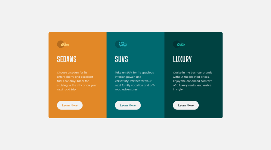
3-column preview card component solution
Design comparison
Solution retrospective
Hello! Any feedbacks are welcome!
Community feedback
- @shashreesamuelPosted almost 3 years ago
Good job completing this challenge
Keep up the good work
Your solution looks great however I think that the card needs to be a bit taller thus the height needs to be increased a little bit.
In terms of your code, I recommend deferring from using element selectors which directly target elements because it will apply any styles added to all the instances of that specific selector across the document and will lead to specificity errors. You should use class selectors since it is low in specificity and the aim is to have low specificity.
I hope this helps
Marked as helpful1
Please log in to post a comment
Log in with GitHubJoin our Discord community
Join thousands of Frontend Mentor community members taking the challenges, sharing resources, helping each other, and chatting about all things front-end!
Join our Discord
