

Design comparison

Solution retrospective
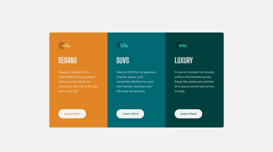
I'm proud of completing this card component project because it showcases my ability to write clean, organized code, solve problems, and design user-friendly interfaces. Each step taught me something new and brought me closer to mastering front-end development!
What challenges did you encounter, and how did you overcome them?At first I used border for the desktop buttons. They were not working well with the hover effect, then i changed to using the border element.
What specific areas of your project would you like help with?Your feedback is appreciated. I would like to hear what you think about the project. Corrections are welcome.
Please log in to post a comment
Log in with GitHubCommunity feedback
- @devceejay
Hi! @AbigirlMuchineripi Great job on the project! but here's my observation, I noticed that you used the h1 tag throughout the entire document. Typically, the h1 tag should be reserved for the main heading of the page, as it helps define the primary topic. For better structure, consider using h2 for main sections. This will improve the document's hierarchy, making it easier for both users and search engines to understand the content. It will also enhance accessibility and SEO.
Hope you find this feedback helpful.
Happy Coding!
- @hitmorecode
Congratulations well done. Looking through your markup up and this is how your markup should be.
<main>
  <section>
    <article>

    </article>
  </section>
</main>
This is the more logic structure. I hope you find this helpful. Keep it up👍👌


Join our Discord community
Join thousands of Frontend Mentor community members taking the challenges, sharing resources, helping each other, and chatting about all things front-end!
Join our Discord