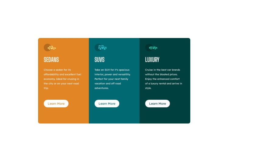


Design comparison

Solution retrospective
one of the things i find difficult in this project is the media query, although i created the desktop version before the mobile version.
Community feedback
- @hitmorecodePosted about 1 year ago
Nice well done. just a few thing you can fix
/* apply these changes to your css */
* {
    margin: 0px;
    padding: 0px;
    box-sizing: border-box;
}

body{
   display: flex;
   min-height: 100vh;
   justify-content: center;
   align-items: center;
   }

   .container{
    display: grid;
    place-content: center;
    grid-template-columns: 1fr 1fr 1fr;
    width: 800px;
    height: 450px;
/*     margin: 200px 200px; */ /* remove this line. flexbox on the body will place the card in the middle of the page */

   }


/* apply these changes to your media query */
@media screen and (max-width:790px) {
    .container{
        display: grid;
        grid-template-columns: 1fr;
        width: unset;
        height: unset;
        margin: unset;
        padding: 3rem 1rem;
       }

    .container-1{border-radius: 10px 10px 0px 0px;

    }

   .container-3{border-radius: 0px 0px 10px 10px;

    }
}
You had three media queries, that is not necessary you can place all of those rules in one media query.
You forgot to add the hover effect on the buttons
Marked as helpful1@sheezylionPosted about 1 year ago@hitmorecode appreciate the feedback and i would definitely look into it.
0 - @sliyarliPosted about 1 year ago
Your HTML and CSS code looks good overall, but there are a few suggestions and improvements you can make:
HTML:
1 - It's a good practice to provide a value for the
descriptionmeta tag within the<head>section for better SEO. For example:<meta name="description" content="Your description here">.2 - In your anchor tags for "Learn More," consider adding
href="#"to make them clickable links. This enhances user experience and accessibility.CSS:
1 - It's a good practice to organize your CSS properties alphabetically or in a structured manner to improve readability and maintainability.
2 - You can combine your media queries to avoid duplication and make your CSS cleaner. For example:
@media screen and (max-width: 480px) {
    .container {
        /* Your styles here for small screens */
    }
    .container-1 {
        /* Your styles here for small screens */
    }
    .container-3 {
        /* Your styles here for small screens */
    }
}
3 - Consider using more meaningful class names. Instead of
container-1,container-2, andcontainer-3, you could use class names that reflect the content they represent, likesedans,suvs, andluxury.4 - You can simplify your CSS by using a single class for the "Learn More" buttons and applying different colors based on the container. For example:
.info-button {
    font-family: 'Lexend Deca', sans-serif;
    background-color: white;
    margin: 50px 30px;
    width: 130px;
    height: 40px;
    line-height: 40px;
    text-align: center;
    border-radius: 20px;
}

.sedans .info-button {
    color: #E28524;
}

.suvs .info-button {
    color: #006971;
}

.luxury .info-button {
    color: #00403E;
}
This way, you can apply the same styling to all buttons and only change the text color based on the container.
Overall, your code is well-structured and responsive. These suggestions should help you make it even better and more maintainable. Keep up the good work!
Marked as helpful0@sheezylionPosted about 1 year ago@sliyarli thank you so much for the feedback, this is so helpful
1@sliyarliPosted about 1 year ago@sheezylion, don't mention, feel free to ask more!
Marked as helpful0


Please log in to post a comment
Log in with GitHub
Join our Discord community
Join thousands of Frontend Mentor community members taking the challenges, sharing resources, helping each other, and chatting about all things front-end!
Join our Discord