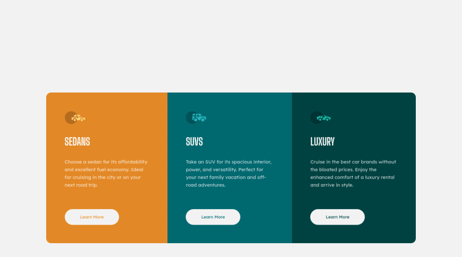
Design comparison
Solution retrospective
This is my first project with the Frontend Mentor website. I will be grateful for checking my code to be able to improve my skills and knowledge :)
Community feedback
- @fidellimPosted about 3 years ago
Hi Dawid,
congrats on finishing your first FEM project! Well done! It looks great for mobile and desktop views. Just a suggestion I would like to share is that you can add hover and active states to your buttons. This will help users checking your site that those elements are clickable.
I hope it helps :)
Marked as helpful0 - @MarlonPassos-gitPosted about 3 years ago
congratulations for your first challenge, some suggestions: Add this code in the body to center the card
min-height: 100vh; display: grid; place-intens: center;.- Each of the sections could be inside a <section> tag and all the content could be inside a <main> tag, this would make the code more semantic and organized.
- Seeing that you styled css using standard HTML tags, I would recommend you always use classes to style as this helps to avoid errors in the future
Marked as helpful0
Please log in to post a comment
Log in with GitHubJoin our Discord community
Join thousands of Frontend Mentor community members taking the challenges, sharing resources, helping each other, and chatting about all things front-end!
Join our Discord
