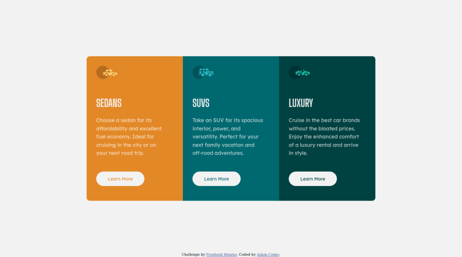
Design comparison
SolutionDesign
Solution retrospective
This was the second challenge that i had been completed and it seems my skills are improving a bit by bit.. visitors review my solution and help me grow
Community feedback
- @tedikoPosted over 3 years ago
Hello, Adam! 👋
Congrats on finishing another challenge! 🎉 Your solution looks very good and also responds well. Here's my few tips:
- Change the
altattributes for the icons images, as they don't add any extra context for screen reader users. Since your images are decorative youralttext should be provided empty (alt="") so that they can be ignored by assistive technologies. - Read about semantic. Semantic elements lead to more consistent code, they are easier to read and improve accessibility.
Good luck with that, have fun coding! 💪
Marked as helpful2@AdamCodes42Posted over 3 years ago@tediko Thanks 😊...will see to the change and also improve it by using semantic elements 💪... i visited your solution and loved it ✌
1 - Change the
Please log in to post a comment
Log in with GitHubJoin our Discord community
Join thousands of Frontend Mentor community members taking the challenges, sharing resources, helping each other, and chatting about all things front-end!
Join our Discord
