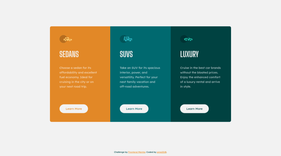
3 column preview card using grid, flexbox and custom properties
Design comparison
Solution retrospective
- I'm using Andy Bell's Modern Reset with some minor changes. The reset contains the following bit:
/* Remove list styles on ul, ol elements with a list role, which suggests default styling will be removed */
ul[role='list'],
ol[role='list'] {
  list-style: none;
}
Yet setting role to list is treated as a mistake in the report. Is it a bad idea to use role="list" to remove default styling?
- There was no tablet view. It doesn't seem necessary but should it be added somehow anyway?
Community feedback
- P@dwhensonPosted over 2 years ago
Hi, just to add that there's a "bug " or rather a decision made by Safari that removes some of the functionality from lists that screen readers need, details here: https://www.scottohara.me/blog/2019/01/12/lists-and-safari.html
I use this reset, and just accept that the HTML linter will flag issues each time. This is a bit of a tricky one, and I don't know how to call it, so in the absence of better guidance, I just follow Andy's suggestion and add the attribute.
Marked as helpful1P@ania221BPosted over 2 years ago@dwhenson
Hello Dave,
Thank you very much for the article and sharing how you approach this! I had no idea Safari did that and I was confused about the reset, now it's clearer for me.
Thank you again and have a great day!
1 - @Yasmine10Posted over 2 years ago
Hi Ania 👋🏻
-
When you're using
<ul>or<ol>a screenreader knows that that is a list because they're semantic elements that are used for lists. So like the report says,role="list"is unnecessary because it already knows it's a list without adding the role. It would be useful to add it when you're using a div as a list for example, because<div>is not a semantic html element and a screenreader won't know you're using it as a list. -
Also if you want to remove the list-style of
<ul>and<ol>, you could add the following instead of the role:ul[class]andol[class] -
And for the tablet view, it depends on how the website looks and where you placed a breakpoint. If you look at my solution you will see it's not really necessary in this case. If you just remove this line
grid-template-columns: 21rem;in.gridfor the mobile version, you don't really need a tablet view.
Hope this helps! Your solution looks great btw😊
Marked as helpful0P@ania221BPosted over 2 years ago@Yasmine10
Hello Yasmine!
Thank you very much for your tips.
- I was worried that maybe
role="list"on aolorulwas confusing for people using screenreaders. - I was using
ul[class]andol[class]before but then I thought: What if I need a class to style lists that will actually look like lists? Yet, I think this is a maybe less common situation and I can always change it then. Thank you! - I had a look at your solution. It's really good 😃. I used
21rembecause I though that maybe these cards were supposed to stay narrow on tablets. I guess you're right and it depends on the whole website.
Thank you again for taking time to look my solution and your advice 😃
Have a great day!
0 -
Please log in to post a comment
Log in with GitHubJoin our Discord community
Join thousands of Frontend Mentor community members taking the challenges, sharing resources, helping each other, and chatting about all things front-end!
Join our Discord
