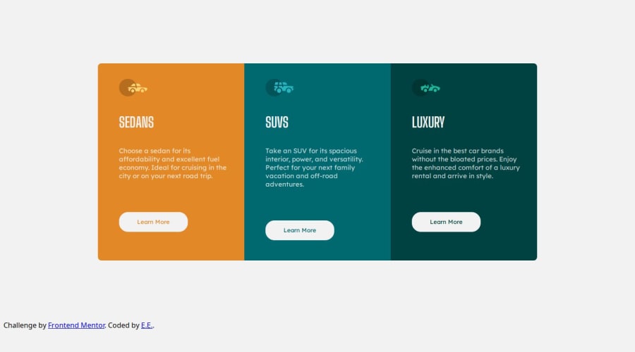
Design comparison
Solution retrospective
My goal now is to write responsive design with minimum code, because we can do it right away with thousands of code, but this is not the point and i think and i'm trying to do it and i learn something new everytime.
What challenges did you encounter, and how did you overcome them?I encounter challenge with the responsive design where at some point the boxes were too high and i try to do them without @media property, but the problem was from the elements - padding and margin.. at some point they were "trying" to fit in the boxes, because of their padding and margin and also from the padding of the container itself...
What specific areas of your project would you like help with?I use everytime ems and rems and they need to be responsive, but when i test my code at different resolutions, the element`s padding and margin aren't changed at all... and i don't understand why.. when i use % for padding and margin at different resolutions they changed, but not for ems and rems.. strange..
Community feedback
Please log in to post a comment
Log in with GitHubJoin our Discord community
Join thousands of Frontend Mentor community members taking the challenges, sharing resources, helping each other, and chatting about all things front-end!
Join our Discord
