Not Found
Not Found
Not Found
Not Found
Not Found
Not Found
Not Found
Not Found
Not Found
Not Found
Not Found
Not Found
Not Found
Not Found
Not Found
Not Found
Not Found
Not Found
Not Found
Not Found

Submitted

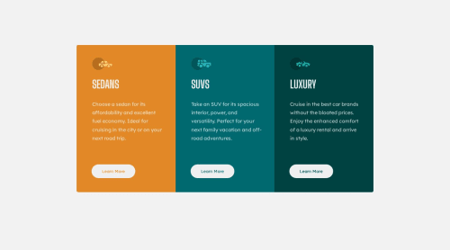
3 column preview card. Flex Mobile and grid to desktop

@GabrielNoss

Desktop design screenshot for the 3-column preview card component coding challenge

This is a solution for...

  • HTML
  • CSS
1newbie
View challenge

Design comparison


SolutionDesign

Solution retrospective


I have problems when the pointer is placed over the button it has to be over the letters to be seen. On the other hand, it gets a little bit longer at the bottom when you put the pointer over the button. If someone can help me to correct that. Thank you very much for your help.

Community feedback

@freaky4wrld

Posted

Hey there buddy congratulations on completing the challenge, as far as your queries are concerned here's what you can do..........

  • first of all remove that a tag inside the button, that's the problem that the text "Learn More", shows up when you hover over that, button is complete in itself, it doesn't need <a> tag inside it, you can always use javascript to decide the functionality of the button and it's easily accessible like the <a> tag, follow the code...... <button class="sedan/suv/luxury-btn">Learn More<button>

  • then to resolve your increasing height issue, in your code you have given a border: none property to your button and when you are hovering over it you are providing it with new borders as border: 2px solid white , that's what is causing the whole problem.....here's what you can do

button{
        // add the border to the button with the same background color of your button
        border: 2px solid [color-same-as-background-color-of-button];
}

button:hover{
          // remove the border property from here and do the same you were doing
}

I hope this clears all your doubt, and makes it easy for you........glad to help!!!

Marked as helpful

1

@GabrielNoss

Posted

@freaky4wrld Hey buddy I did it as you said and the hover behaves as the challenge asks. Although I don't understand how the white border appears. Anyway, thank you very much, you helped me a lot. PS: English is not my native language.

0
hitmorecode 6,230

@hitmorecode

Posted

Nice well done. This is how you can fix it. Let's start with why this is happening.

  • Your button has no border and when hovering you add 2px (which is a total of 4pxs) border.
  • These 2px is than added to the overall pixels in the card, that's why the cards grow and shrink when hovering over the buttons.
  • To fix this add the border to the button, so that 2px is always there. Just change your css when hovering make the background transparent without adding the 2px border.
  • As for why the text only shows when hovering over it and not the button is, because the <a> is not filling the empty space inside the button. Give the <a> a background color and you'll see it. You can remove the button and only use the <a>.

Marked as helpful

1

@GabrielNoss

Posted

@hitmorecode Thanks very much buddy. You helped me correct the problem. I don't understand how the white border appears on hover, but it works.

0

Please log in to post a comment

Log in with GitHub
Discord logo

Join our Discord community

Join thousands of Frontend Mentor community members taking the challenges, sharing resources, helping each other, and chatting about all things front-end!

Join our Discord