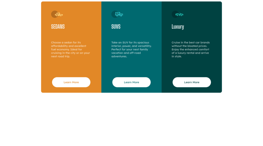
3 column preview card Component using only HTML and CSS
Design comparison
Solution retrospective
While it is not exactly like the design images, to me, it is the journey of doing this project that mattered to me more than the result. I practiced and learned new tips, tricks, and knowledge with both HTML and CSS. This process of learning made doing web development more fun more me. As usual, I would like some feedback on how to improve my Front End Skills, particularly HTML and CSS.
Community feedback
- @CyrusKabirPosted over 3 years ago
hello my dear friend ♥ you did good and clean but here some advices :
- go and search about this term " css centering way " and learn them good
- add some line-height to your card text
Marked as helpful2 - @fidellimPosted over 3 years ago
Hi @milessteamaccount,
Great job finishing the project! Some suggestions I would like to share are of the following:
- you could use some hover and active states on your buttons to make it interactive.
- you could add media queries so that you can change the look of your mobile view.
I hope these help :)
Marked as helpful2
Please log in to post a comment
Log in with GitHubJoin our Discord community
Join thousands of Frontend Mentor community members taking the challenges, sharing resources, helping each other, and chatting about all things front-end!
Join our Discord
