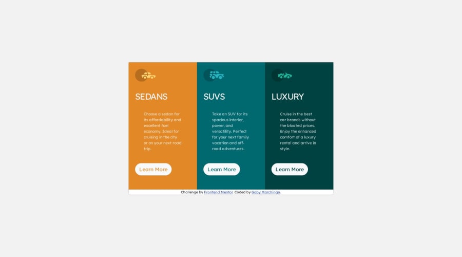
Design comparison
SolutionDesign
Solution retrospective
mainly had trouble with the font not looking right
Community feedback
- @hitmorecodePosted about 1 year ago
Nice well done, you are only missing the border radius and while hovering over the button the background should be the same color as the card background and there should a border on the button
0
Please log in to post a comment
Log in with GitHubJoin our Discord community
Join thousands of Frontend Mentor community members taking the challenges, sharing resources, helping each other, and chatting about all things front-end!
Join our Discord
