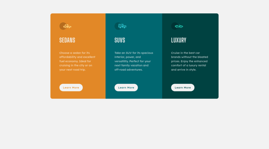
Design comparison
SolutionDesign
Solution retrospective
Any advice/feedback appreciated!
Community feedback
- @brkclnPosted over 3 years ago
Hey there, thanks for the sharing your work. Its pretty good. But i can say 2 3 thing about that.
- its not centered, may wanna look at ..(You can use flexbox for that.)
- setting fixed "height" and "with" not a good practice can overflow when text too much,
- for padding and margin may wanna use "em" units, "rem" better for "font-size" good work keep up^^
0@patricia-hurstPosted over 3 years ago@brkcln
- It is centered on both Chrome and Firefox. Not able to check other browsers. Centering is accomplished with margin: 0 auto < 925px and flex / justify-content: center > 925px.
- I know this isn't normally a good practice, but with the media queries that I set here the text wouldn't overflow unless you took the viewport width to less than 325px, which I'm fairly sure the majority of mobile phones these days are 375px at minimum
- This I do need to work on, thanks for the tip!
0
Please log in to post a comment
Log in with GitHubJoin our Discord community
Join thousands of Frontend Mentor community members taking the challenges, sharing resources, helping each other, and chatting about all things front-end!
Join our Discord
