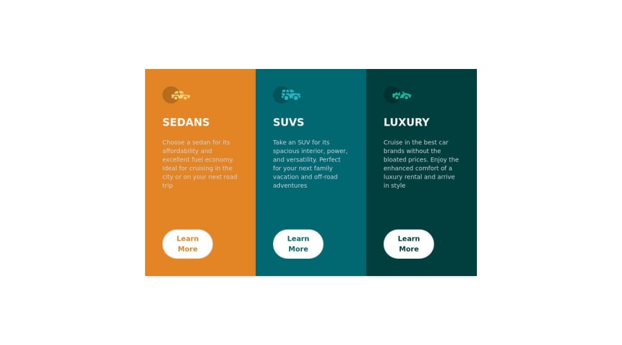
3 column cards component
Design comparison
Solution retrospective
I've tried to make more challenge here, i've built the component by creating a table with a .map.
I have some trouble with the hover of the buttons, so if you guys got the answer, it will be great !
I know it is probably not like what i have done, but i wanted to make challenge for myself.
Thanks a lot :)
Community feedback
- @TheRequiemPosted over 1 year ago
Since you are using inline CSS of Tailwind CSS. You have to add
hover:before the style inclassNamesuch asclassName="hover:bg-sky-700".Marked as helpful0@dylanguaquierPosted over 1 year ago@TheRequiem
Hey ! Thanks for your reply, i have tried already to make a background hover, but the problem is that i am using a .map, so every card (x3) have the same background, i wonder how is it possible to make a different background hover on each card, i don't know the information yet, but i think it is possible somehow. I will comeback on this later to make sure that is possible to deal with this. Thanks again ! :)
1@TheRequiemPosted over 1 year ago@Fullpacki
Hmm, mapping complicate things when each item needs to be handled uniquely and one solution can be if you provide a unique id with
keyattribute and generate a unique id for each mapped element with something unique like cryptoID or current Day/Time in an object or an array along with the element. You will then need to use a ternary operator or an if condition to check if the id of the mapped element is equal to the id of the element you want to change and if true, you add the custom class. For exampleclassName = {object.id == id (This id is whatever you name it in your parameter while setting up function while mapping) ? ':hover:bg-sky-700 bg-green-500 etc' : 'all the tailwind classes you are already using without the hover' }Though, it's awesome that you pushed yourself for the challenge by mapping when it wasn't needed and the fact that you still went ahead and want solutions instead of backing. Keep in mind that the map feature is best used when you need to keep things as identical as possible about the layout except for the new information that you provide with the props. Now, if I were you honestly, I don't think its worth it to map something like this and its good to get an idea how would such a problem be tackled as I mentioned for your curiosity but if you really set up your mind to it and it is your personal challenge then go ahead and apply the solution, good luck, love your attitude!1@dylanguaquierPosted over 1 year ago@TheRequiem That's kind of you ! Thank you =). Yes, i wanted to push myself cause i haven't much difficulties with basic css, so i wanted to do a .map and try to modify the table myself. And yes, i know that was not the right thing to do and exactly as you said haha, i wanted to push myself, i need to train more my JS skills :).
Thanks again for your advices, maybe i should make it easier to put the solution as basic as possible
1@TheRequiemPosted over 1 year ago@Fullpacki
Glad to be of help! It's alright, it's always a good trait to try new things even if they seem silly, that's how a lot of problems in programming are solved and ofc more are created lol, however, if you want to push yourself, try harder challenges with CSS and JS, a lot of challenges in this website have sort of hidden challenges in them such as for example, the layout changes on mobile viewport etc. Also, as for mapping, you can try this one. It is not that hard but it would be nice if you can map each category and use the provided .json file to map the values. It would be a decent challenge for your CSS (Grid), JS and React.js
0 - @hitmorecodePosted over 1 year ago
Congratulations well done. I took a look at what you did and from what I can see is that the css file where the hover rule is set, is not linked to the html file. If you add a link to the css file in your html, this should work just fine
Marked as helpful0@TheRequiemPosted over 1 year ago@hitmorecode
He is using Tailwind CSS and I do not see him using an external CSS file but inline class names of Tailwind CSS
Marked as helpful0@dylanguaquierPosted over 1 year ago@hitmorecode Hi, yes i use tailwindcss and i am using only a .css to make a background on the body sometimes
0 - @adityaphasuPosted over 1 year ago
Hii
As @TheRequiem has described you can use
hover:as a prefix for tailwind to apply styles. I also read your reply to his feedback and it's quite easy to do!- Instead of using different background colors you can just apply
hover:bg-transparentto the button andhover:text-whitefor the text! Using transparent background would result in the button to have the parent background on hover. - Make sure to make the text white too on hover or else it might become invisible haha!
Nice solution though! I quite like it especially the usage of map and the styles from list 😊
1@dylanguaquierPosted over 1 year ago@adityaphasu Oh thank you ! I will try it right now !
1 - Instead of using different background colors you can just apply
Please log in to post a comment
Log in with GitHubJoin our Discord community
Join thousands of Frontend Mentor community members taking the challenges, sharing resources, helping each other, and chatting about all things front-end!
Join our Discord
