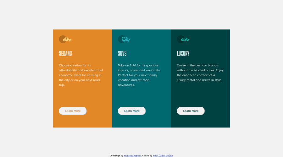
Design comparison
Solution retrospective
This is my first responsive web design. Any feedback would be great for me. Thank you everyone!
Community feedback
- @fatihcandevPosted almost 4 years ago
Great work! My suggestion would be that it would've been better if you'd have created only one card class and use it three times in the html instead of using id's for styling. This will help reduce code and make the code more understandable. Keep it up 👍🏼
1 - @RayaneBengaouiPosted about 4 years ago
Hello Helin,
Congrats for completing your first challenge ! 🙂
I would like to suggest :
-
Adding
border-radiusproperty to your.containerclass to make your edges rounded. Don't forget to also addoverflow: hiddenso that the content doesn't mask the effect. -
Add
cursor: pointerto your buttons to make them look clickable. -
Add
font-family: inheritto your buttons to override the default font for buttons. -
I don't think
flex-wrap: wrapis a good idea there as the display will result with 2 rows of 2 cards and 1 cards when the screen size will decrease. Instead, I think that using a media query when the container get nearly pushed and addingflex-direction : columnto it might be a better solution. -
Take a look at semantic HTML tags for better readability. Instead of using <div> elements only, there are plenty of other tags that describe your code better.
-
Lastly, you could remove the outline of your buttons with
outline: none. It's a personal preference, but I think it's great especially when buttons are rounded.
Overall, well done for the challenge and happy coding ! 😃
0@helinozlemmPosted about 4 years ago@RayaneBengaoui Thank u for your helpful feedback :D i will update my code as soon as possible
0 -
Please log in to post a comment
Log in with GitHubJoin our Discord community
Join thousands of Frontend Mentor community members taking the challenges, sharing resources, helping each other, and chatting about all things front-end!
Join our Discord
