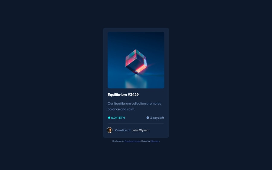
Design comparison
Please log in to post a comment
Log in with GitHubCommunity feedback
- @DrainGK
Well done!
I cannot see the difference, you must have hawk eyes. Liking and saving your solutions congratulations
ps: Order the rest of the comments, otherwise it was too short x)
Some recommendations regarding your code that could be of interest to you. 🤗
In order to fix the accessibility issues
You need to replace <div class="container"> with the <main> tag. You'd better use Semantic HTML, and you can also reach more information about it from [Using Semantic HTML Tags Correctly] Each main content needs to start with an h1 element, and also contain only one h1 element. Your accessibility report states the need for one main landmark. So, you need to use a <h1> element in the <main> tag instead of using the <h2> element. You can replace the <h2>Improve your front-end skills by building projects</h2> element with the <h1>Improve your front-end skills by building projects</h1> element. Hope I am helpful. :)
Join our Discord community
Join thousands of Frontend Mentor community members taking the challenges, sharing resources, helping each other, and chatting about all things front-end!
Join our Discord
