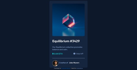
Ok... so any suggestion??
Zizi Aymen
@zizi-aymanAll comments
- @cyberohn2Submitted about 2 years ago@zizi-aymanPosted about 2 years ago
Hello @cyberohn2, Congratulations on completing this challenge! 1: you forget the active status, also title "NFT preview card component", and you didn't apply the font Here are some tips to improve your solution code: 1: add height: 100vh to body to make the body height take all of the screen height 2: Use <main> instead of <div> (use the semantic tags )it will make your HTML more comprehensible and make it clear to the browser what the meaning of a page and its content is. 3: Try to not use width too much and if use it uses min-width for a more responsive web design I hope this helps you and happy coding!
1 - @thresholdtechSubmitted about 2 years ago
hi everyone, this is the first solution I made. I'm still struggling with margin, position, and other CSS properties. I don't know if I made it correctly, but I will continue learning. Any feedback would be appreciated. tia
@zizi-aymanPosted about 2 years agoHey, @thresholdtech congratulations on completing this challenge. few notes to consider: you forgot the active status, and try to do all styles in the CSS file, and you repeat font-family: 'Outfit', sans-serif too much you can change it with *{ font-family: 'Outfit', sans-serif; } or replace * with body. I hope this helps.
1

