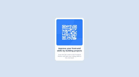
I finished the challenge in like an hour or so, but it took me some time to figure out how to deploy to Github Pages lol but I finally did it. It was a fun task but quite easy. I'm not sure how I did with the box shadow btw but pretty sure the spacing is correct. Congrats for my first challenge here🥳
Yavuz KARAKUŞ
@yavuzkarakusAll comments
- @uratebSubmitted 11 months ago@yavuzkarakusPosted 11 months ago
Hi Uratë Bekaj! 👋🏻
It looks pretty good. It's good that you're using Vue and Sass. 💯 But in HTML all your containers are built with
<div>. You can try using semantic tags. You can see the documentation about semantic tags by clicking here.Happy coding! ⚡
Marked as helpful0 - @JonathanCarltonSubmitted 12 months ago@yavuzkarakusPosted 12 months ago
Hello @JonathanCarlton, 👋
If you want your code to be more readable, I recommend using semantic tags in HTML. Semantic tags will not only make your code more readable but also help you write consistent code. That's why you should use tags like
<header></header>,<footer></footer>,<main></main>.For more details, you can learn more about semantic tags by clicking on the link here.
Happy coding! 🤩
0 - @xhemalsSubmitted 12 months ago@yavuzkarakusPosted 12 months ago
Hi @xhemals,
I can suggest a few things to change and simulate the look a bit more. First of all, in order to use flexbox, you need to give
display: flex;to the parent of the object you want to center. On the other hand,position: absolute;is not a feature we usually prefer. At least that's how I know. 🙃If you have difficulties, you can click here to check my GitHub account. But please try to write code yourself first. After all, as the saying goes; fake it until you make it. 😉
Happy coding!
0


